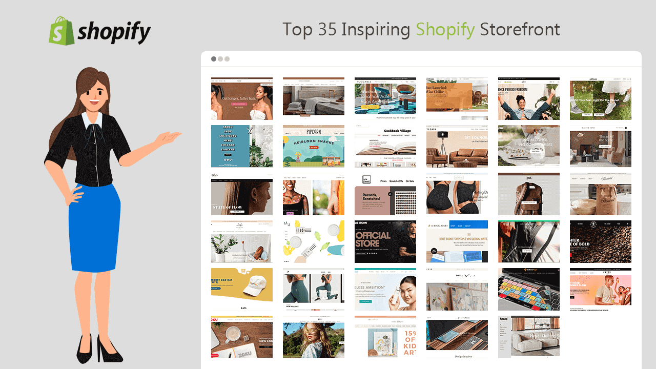
Want to improve your storefront? Here, I have brought 30+ store examples for you with outstanding storefronts. These store owners have made serious efforts to make their Shopify website look more beautiful and trustworthy, thus serving as the inspiring Shopify storefront examples.
What is Storefront?
In eCommerce, the storefront is the visual layer of the online store, which works as the emporium or showrooms for displaying products and serves the shopping experience to the visitors.
In short, a storefront is a place where visitors come, browse the products and buy them. The eCommerce storefront offers everything that is necessary to make a successful purchase online.
A Shopify storefront is made up of the following elements:
- Homepage
- Product page
- Collection/Category page
- Cart page
- Checkout page
- About us, Contact, Terms & Conditions, etc.
When you launch an online store in Shopify, you automatically get a good storefront. But due to the limited functionalities, it looks like thousands of other eCommerce stores.
But if you want to give more personalized buying options for your customers, then you can do it by adding any of the best all-in-one Shopify apps, like iCart Cart Drawer Cart Upsell, to your Shopify store.
A good storefront means a better user experience that results in increased conversion rates. Therefore, Shopify empowers you with the Custom Storefront API to add unique features to your store and enhance the overall shopping experience of your customers.
The Shopify Storefront Examples to Inspire You
| # | Store Name |
|---|---|
| 1 | Lucy Hair |
| 2 | Alfred |
| 3 | Biko |
| 4 | Leif |
| 5 | Zoku |
| 6 | The Citizenry |
| 7 | Pipcorn |
| 8 | Tattly |
| 9 | Happiness Abscissa |
| 10 | Gymshark |
| 11 | SIR |
| 12 | Ruggable |
| 13 | Cookbook Village |
| 14 | Popchart |
| 15 | Kane Brown |
| 16 | Thrive Causemetics |
| 17 | Lindsay Letters |
| 18 | Deny Designs |
| 19 | Poly & Bark |
| 20 | Negative Underwear |
| 21 | A Book Apart |
| 22 | Raven Roxanne |
| 23 | Grovemade |
| 24 | Flex |
| 25 | Hardgraft |
| 26 | NONA |
| 27 | Phone Loops |
| 28 | Editors Keys |
| 29 | Haus |
| 30 | Maiden Home |
| 31 | Allbirds |
| 32 | Death Wish Coffee Co. |
| 33 | Flourist |
| 34 | Press |
| 35 | A&M Floral Space |
Best Shopify Storefront Examples
Luxy Hair
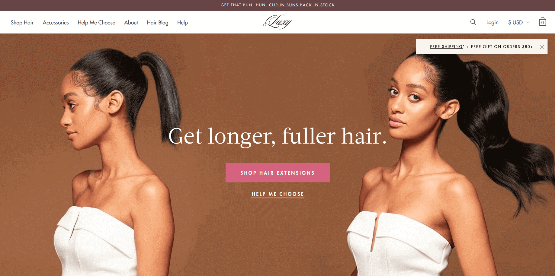
Yes, Luxy Hair comes first on my list because of its awesome shopping experience. When you enter this site, it shows two call-to-action (CTA). One of them will take you to product collections and the second one will assist you to select the best product for you with an attractive survey.
Alfred
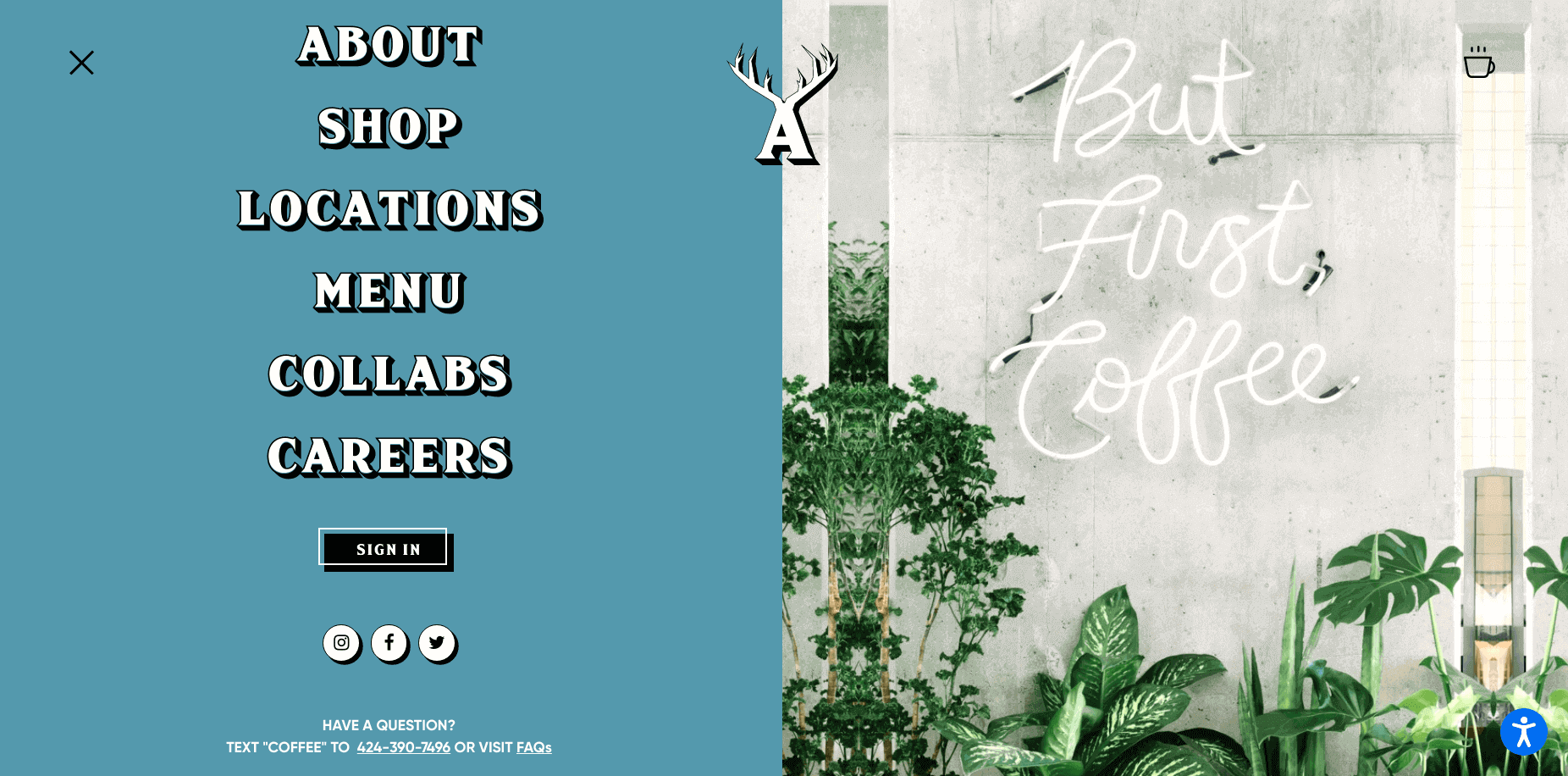
Well, this is not the homepage but it's one of my favorite pages of this store. The cool storefront elevates the cool environment of their coffee shops at different locations. The high-quality photography is mixed with fun illustrative graphics to create a great visual experience for shoppers.
Biko
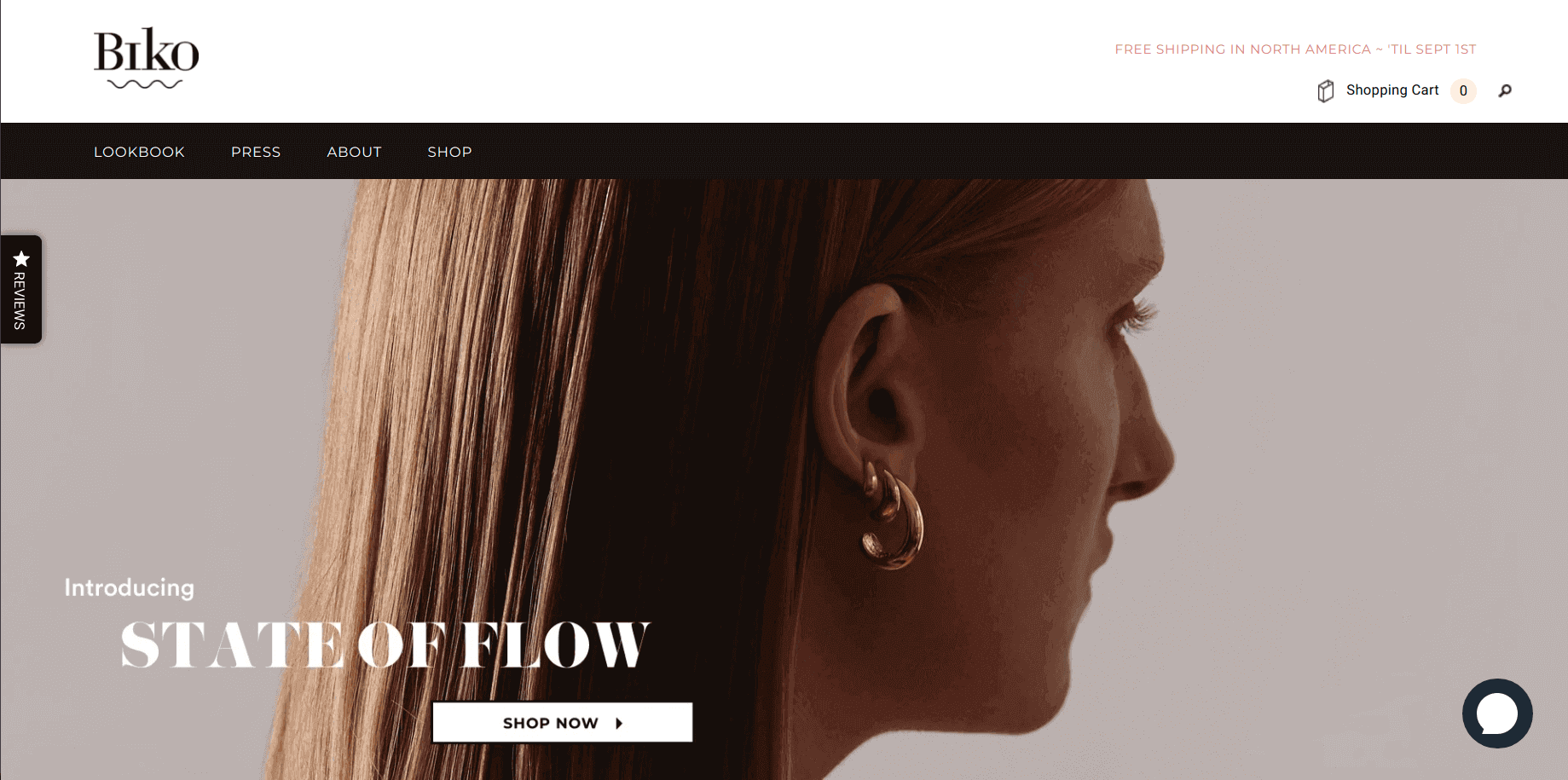
Biko is one of the finest jewelry stores online. They have placed the trending products in the front to save customers’ time. When you open the product page you can find everything to build trust for a purchase.
Leif
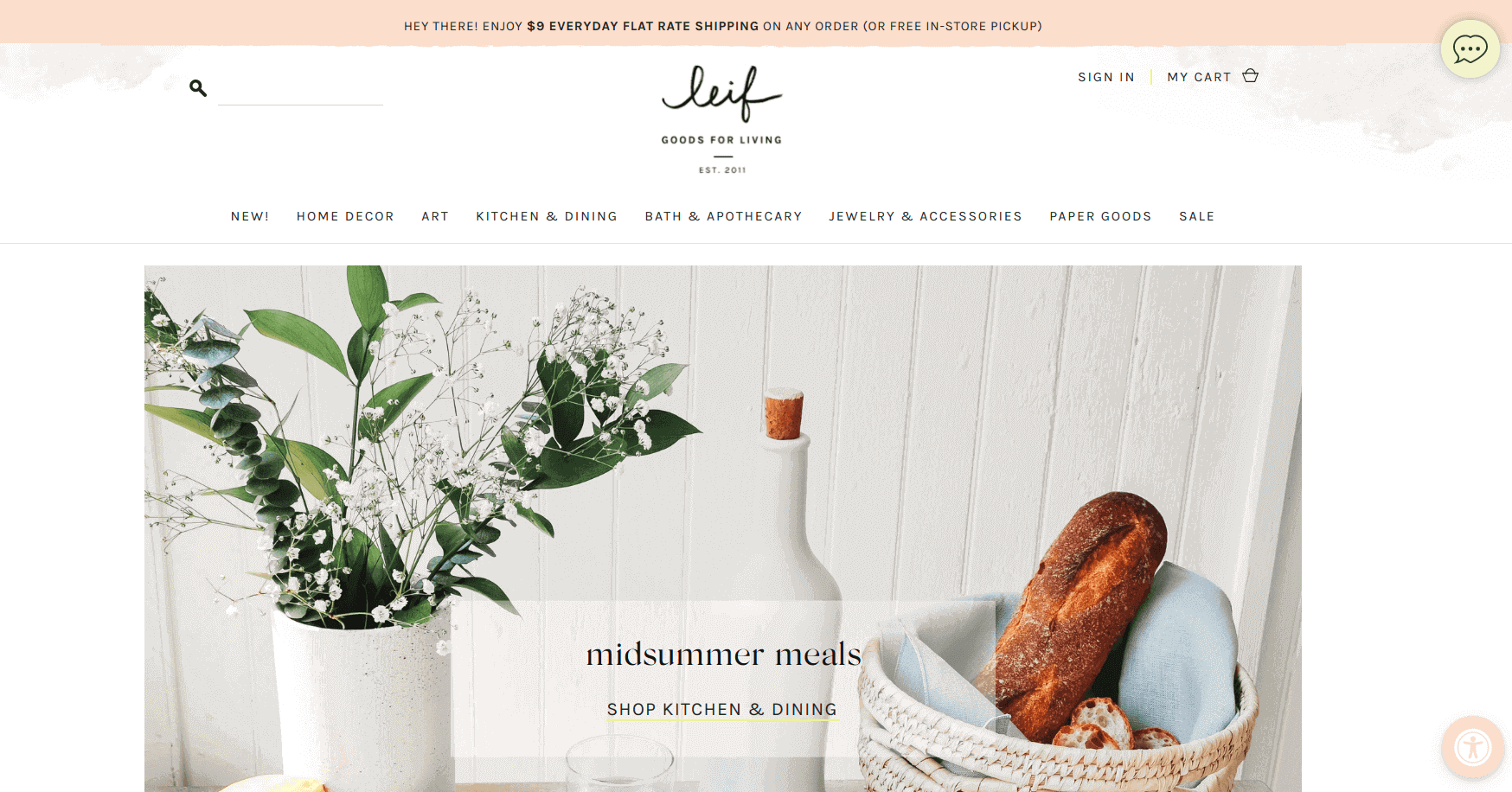
The Leif store represents a beautiful design and a smooth user shopping experience. The homepage doesn’t contain a single product, just redirections to different collections. They have lots of products and all are organized in a way that will steal your heart.
Inspired by these successful storefronts, but unsure how your current store UX compares? A professional eCommerce UX audit service for your Shopify store can help identify usability issues and suggest actionable improvements for better conversion.
Zoku
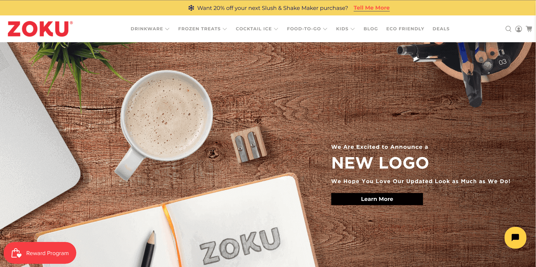
At a first glance at this site, you will find how creative their work is, and love the store. They have created collections that are easy to find and browse for the store visitors. It offers a consistent visual experience and leaves a decent impression of the brand.
Want a storefront like these, but built for conversions?

Storefront inspiration is useful, but the real results come when you recreate that look with the right structure behind it.
Your theme, navigation, collection layout, product page UX, speed, and mobile experience decide whether visitors browse or bounce.
Identixweb helps Shopify store owners turn inspiration into a storefront that feels premium and sells better.
We handle everything from A to Z:
- Store setup (from scratch or migration-ready)
- Theme customization to match your brand
- Homepage redesign and section upgrades
- Collection page redesign (filters, sorting, layout, merchandising)
- Product page improvements (UX, trust blocks, upsells, conversion elements)
- Performance optimization (speed, Core Web Vitals, code cleanup)
- Mobile-first cleanup so everything looks sharp and works smoothly
Want a storefront that looks premium and performs even better?
👉 Explore our Shopify store setup and management solutions
👉 Explore our Shopify apps that are proven to drive growth
The Citizenry
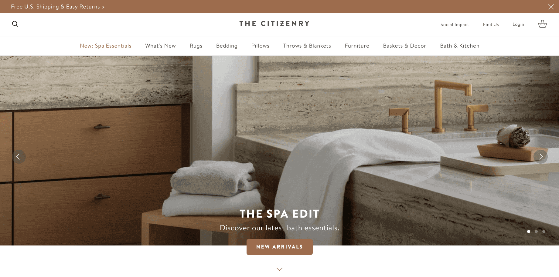
The Citizenry is a sophisticated brand and they have maintained it throughout the store. You can feel the creativity and richness of the products from a single glance at the store.
Pipcorn
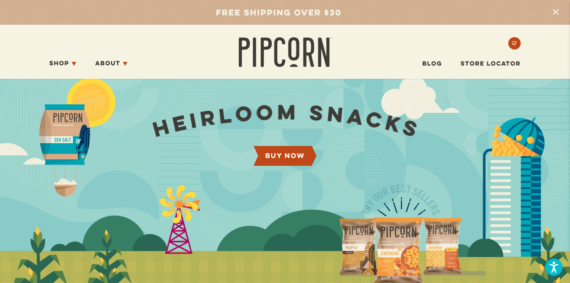
Pipcorn has redesigned its store UI to offer a fun-loving experience to the shoppers. The new storefront is colorful and reflects the quality and naturalness of the product.
Tattly
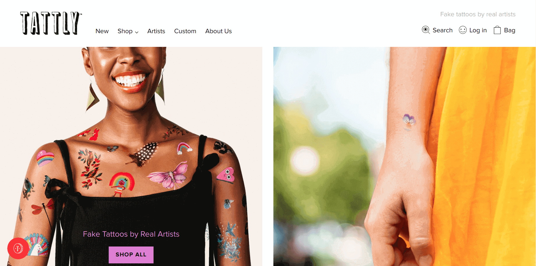
Tattly is the place where you can find creativity blooming everywhere. Every page of this store has something unique for the shoppers, especially when they visit the cart after adding products. When you add products to the cart, it will show the progress bar of Free shipping (offers). Check out how to do that?
Happiness Abscissa
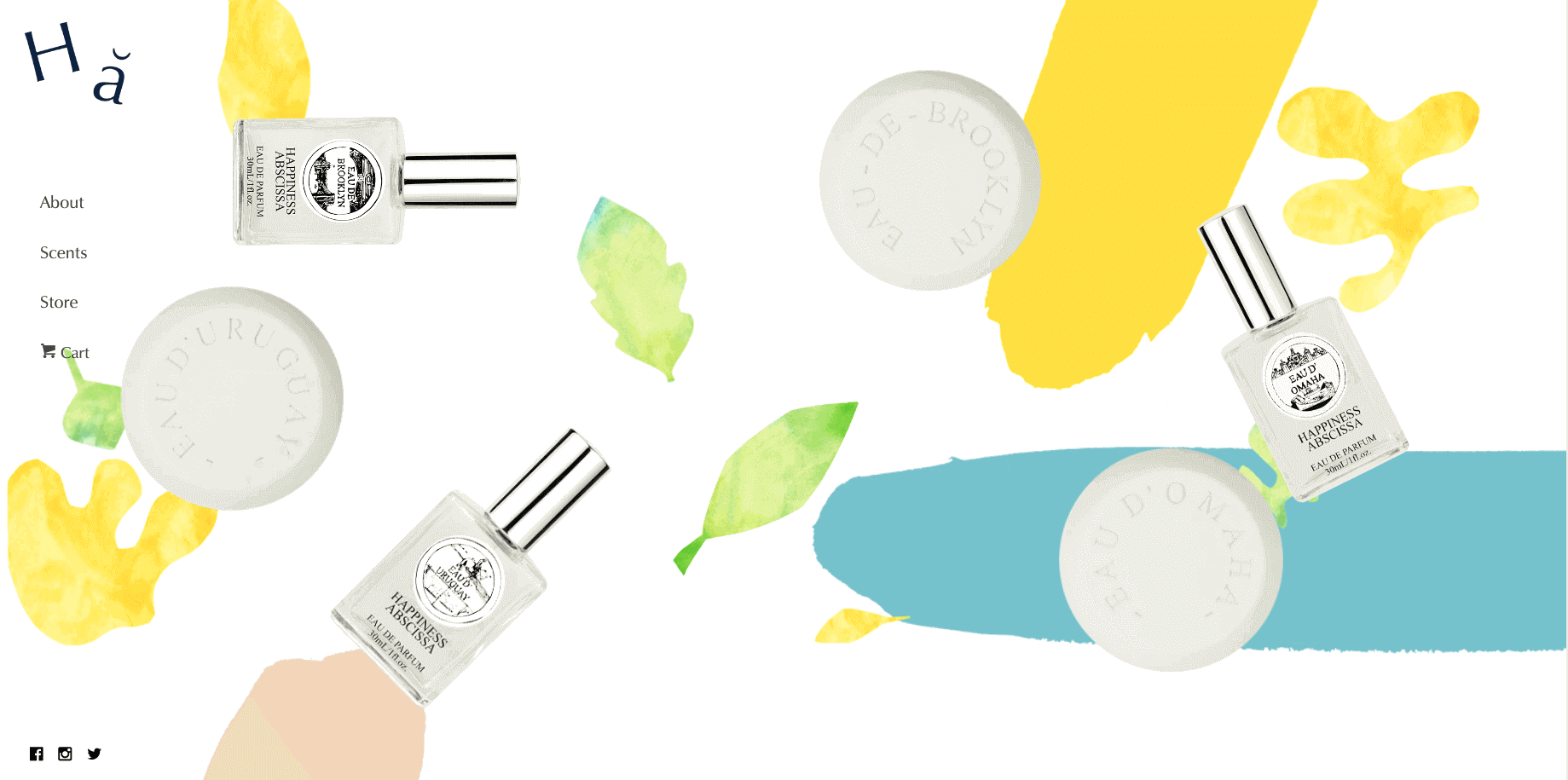
Happiness Abscissa has created an outstanding storefront that makes it different from other Shopify stores. The website uses a sticky navigation bar on the left panel and the rest area is featured with their products and colorful graphics. It looks like everything is free floating in the air.
Gymshark
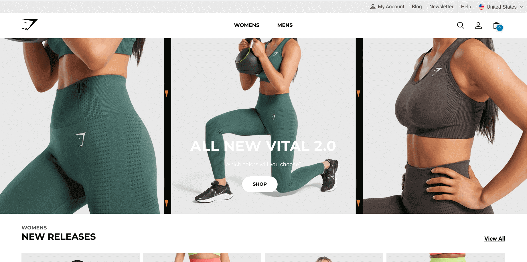
Gymshark has used lots of clean and close-up photographs that give an idea of the material and quality of products. Customers can see the sizes available for the products without opening the product page and quickly add the products to the shopping cart.
SIR
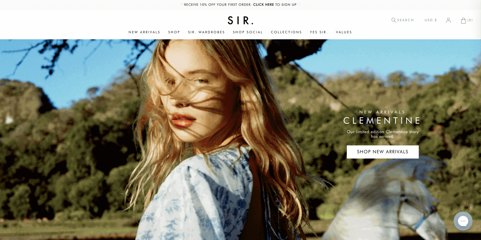
The sleek and elegant photographs used in this store have taken it to a next level. The detailed product page will definitely steal your heart. You can make one with the use of metafields in Shopify. If you have a clothing store, this store is the perfect Shopify storefront example for you.
Ruggable
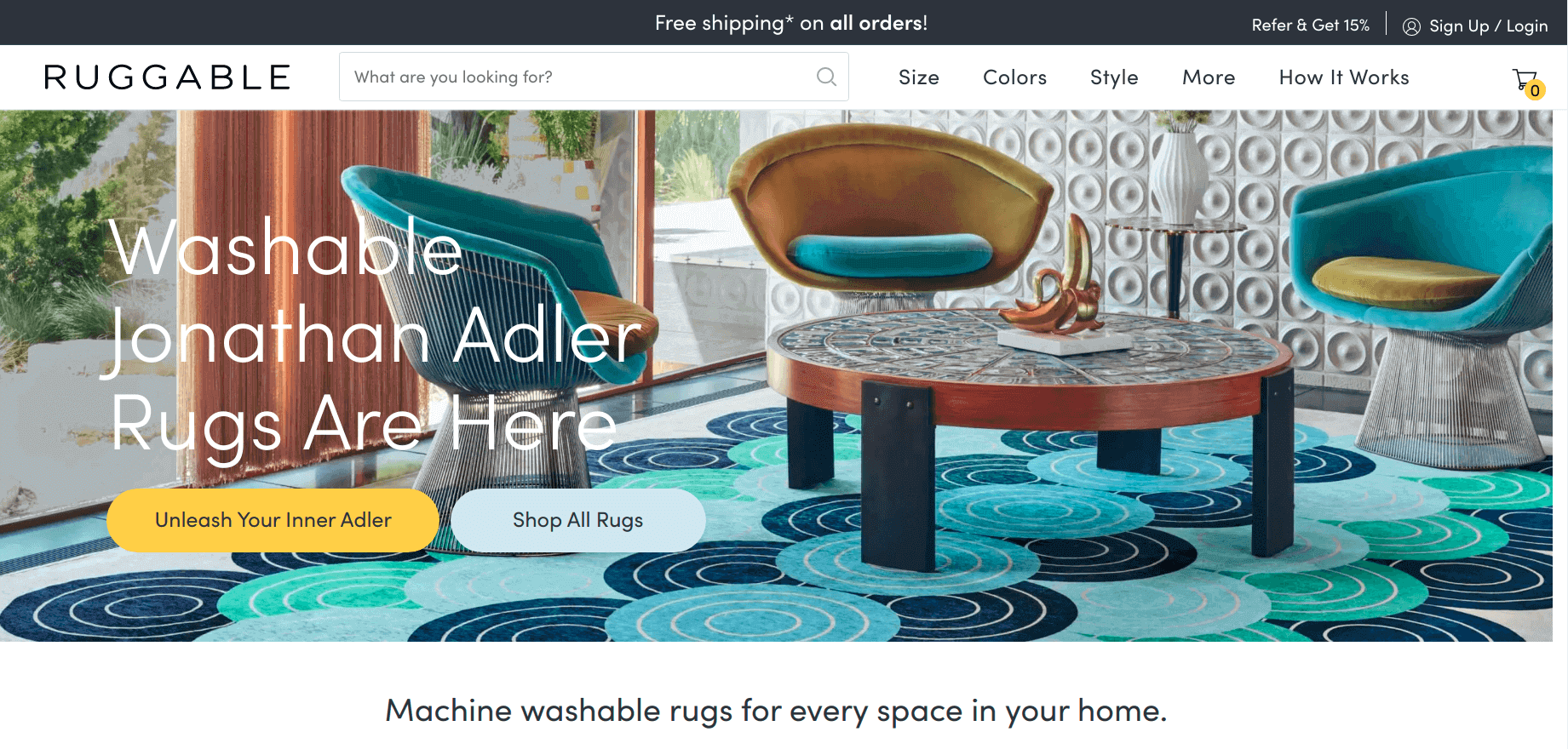
As the name suggests, this Shopify store is about rugs. The big and colorful header image holds the visitor’s eye for a while. As you go down, you can find the collections placed in a unique way. The menus are the one that attracts the most.
Cookbook Village
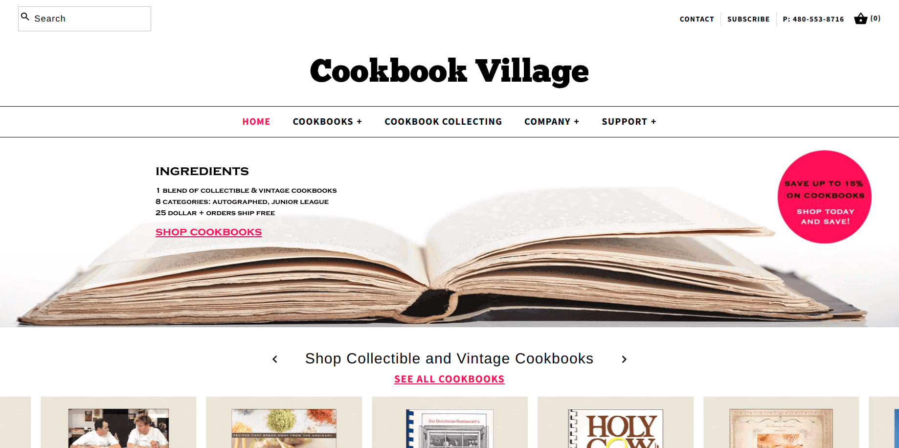
The Cookbook Village is a simple looking store but catches the user's eye in a single glimpse. It shows the books (products in the collection) in a single row with a horizontal scrolling option.
Pop Chart
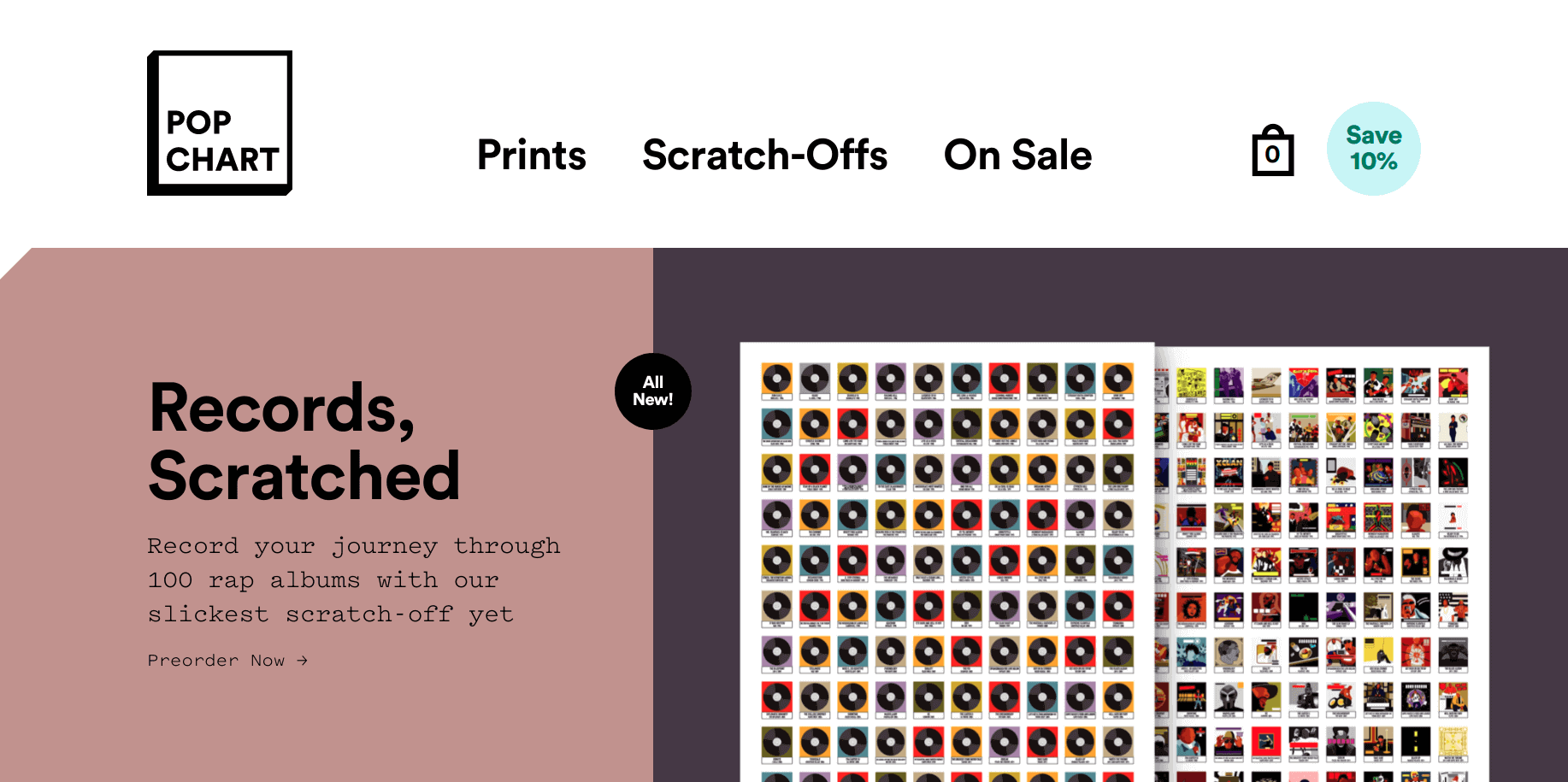
The extra bold fonts on the white background give clear visibility of the important sections in the store. It will also remind you of retro themes. On the hover of the products or collections, it shows an amazing pop-up effect. The overall look and feel make the shopping experience.
Kane Brown
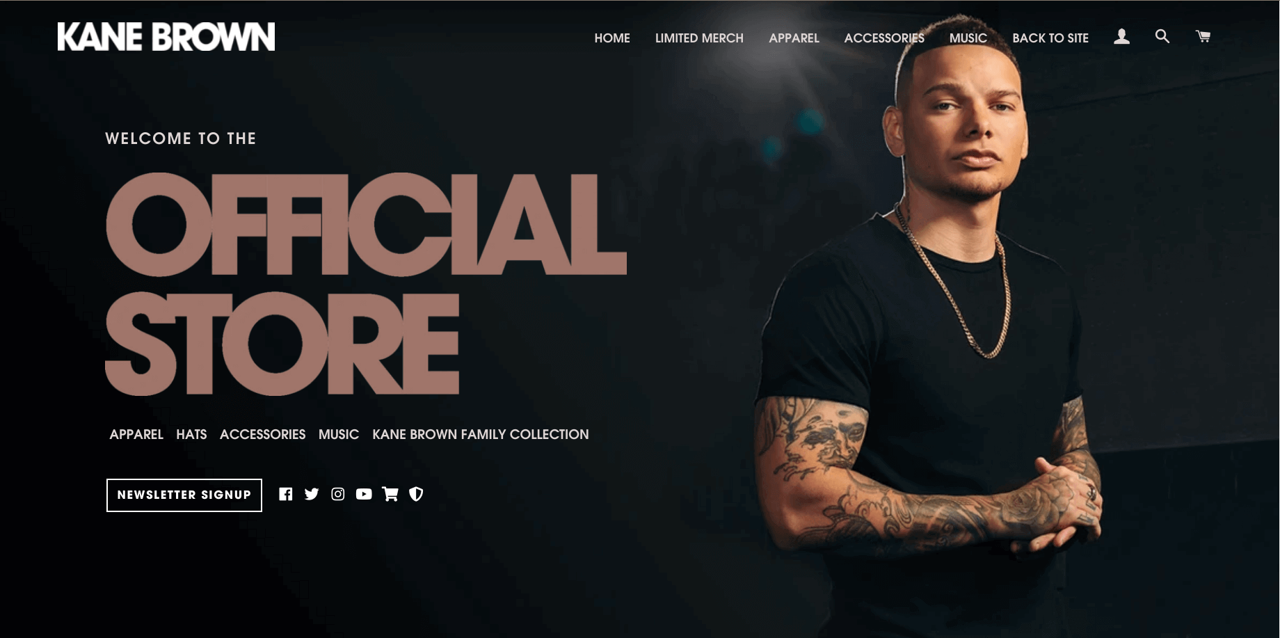
Kane Brown has used black over white background which makes the store more classy. They sell apparel on an easy to navigate website. Kane Brown has placed the important links, newsletter signup, and social media buttons on the header image that’s unique in this store.
Thrive Causemetics
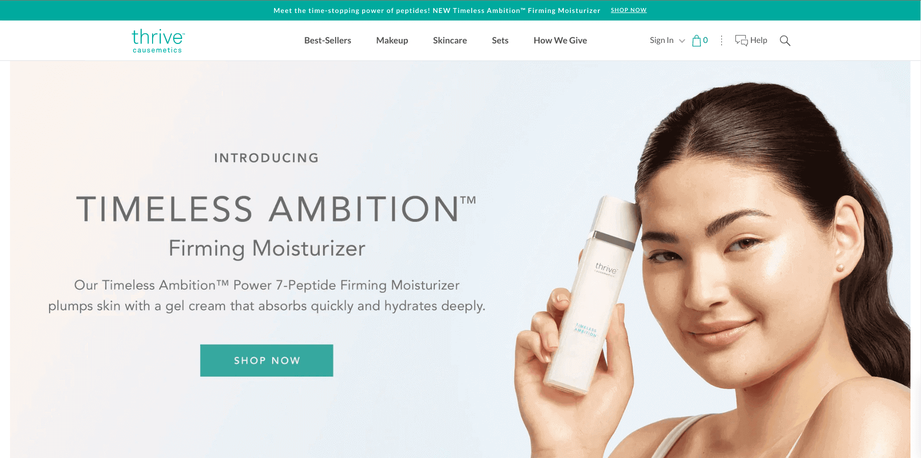
Thrive Causemetics has made an eye calming store. The storefront is simple yet informative, neat, and clean. The plain white background of the store emphasizes the products for the shoppers. Also, when you add products to the cart, a free gift is automatically added to the shopping cart.
Lindsay Letters
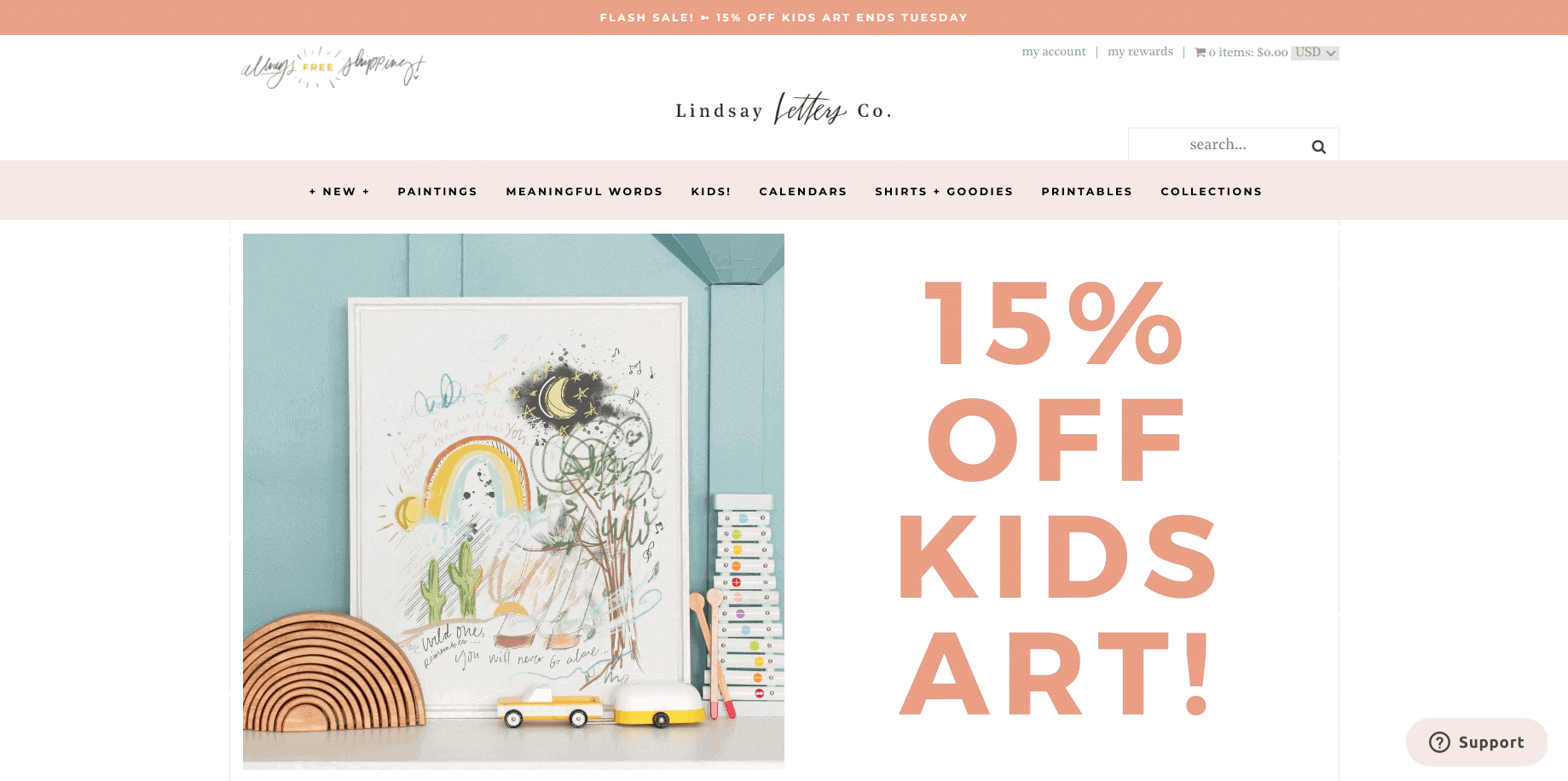
Lindsay Letters has used the offers as the focal point on their website. The homepage of the store is used for brand awareness. The best part to visit is the cart page, it’s beautiful enough to amaze you.
Deny Designs
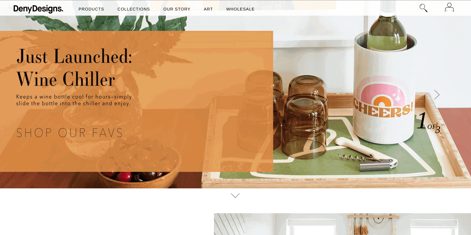
The Deny Designs website uses lots of vibrant colors on a white background to make it look more appealing. The high quality transparent product images on the collection and product pages bring the product to life.
Poly & Bark
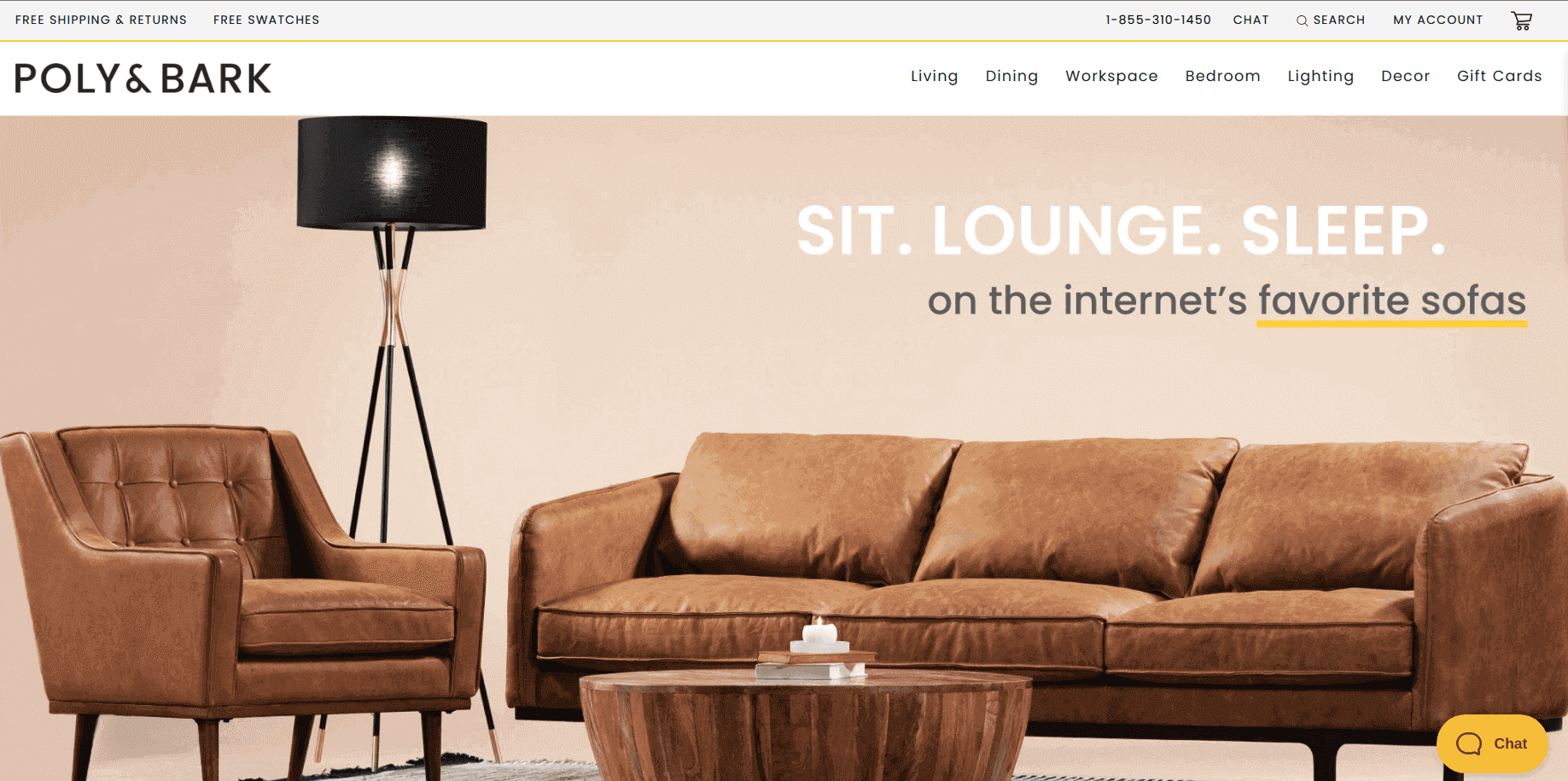
The Poly & Bark store uses a high quality product image on the center that highlights every detail and craftsmanship of the product. Each product page is accompanied by big imagery as well as a detailed description of the product. Appearance-wise, this store is one of the top Shopify storefront examples.
Negative Underwear
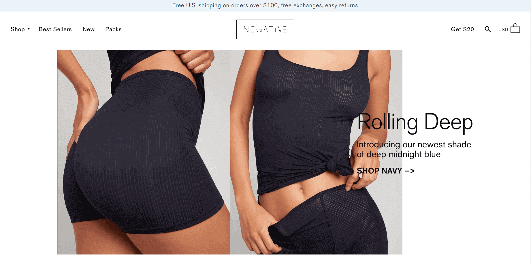
The Negative Underwear storefront reflects comfort with style that conveys their brand identity. Instead of placing the main collections on the header menu, they kept the important links which make easy navigation. The high definition photos on the white background boost the richness of the product.
A Book Apart

As the name suggests, it is an online bookstore with a unique and modern theme. The bright colors and large fonts enhance the readability in the store. On the homepage, they have made great use of RSS feeds to keep their visitors updated about their brand.
Raven Roxanne
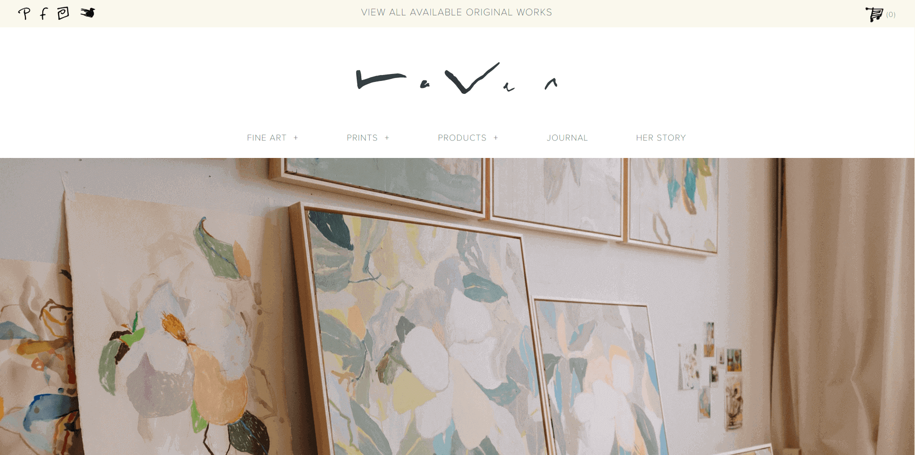
The Raven Roxanne store uses muted colors on a plain white background that gives you a homely feel. As you can see on the header the artist has made use of her art on the storefront. She has also attached a video showing some glimpse of her creativity to the shoppers.
Grovemade
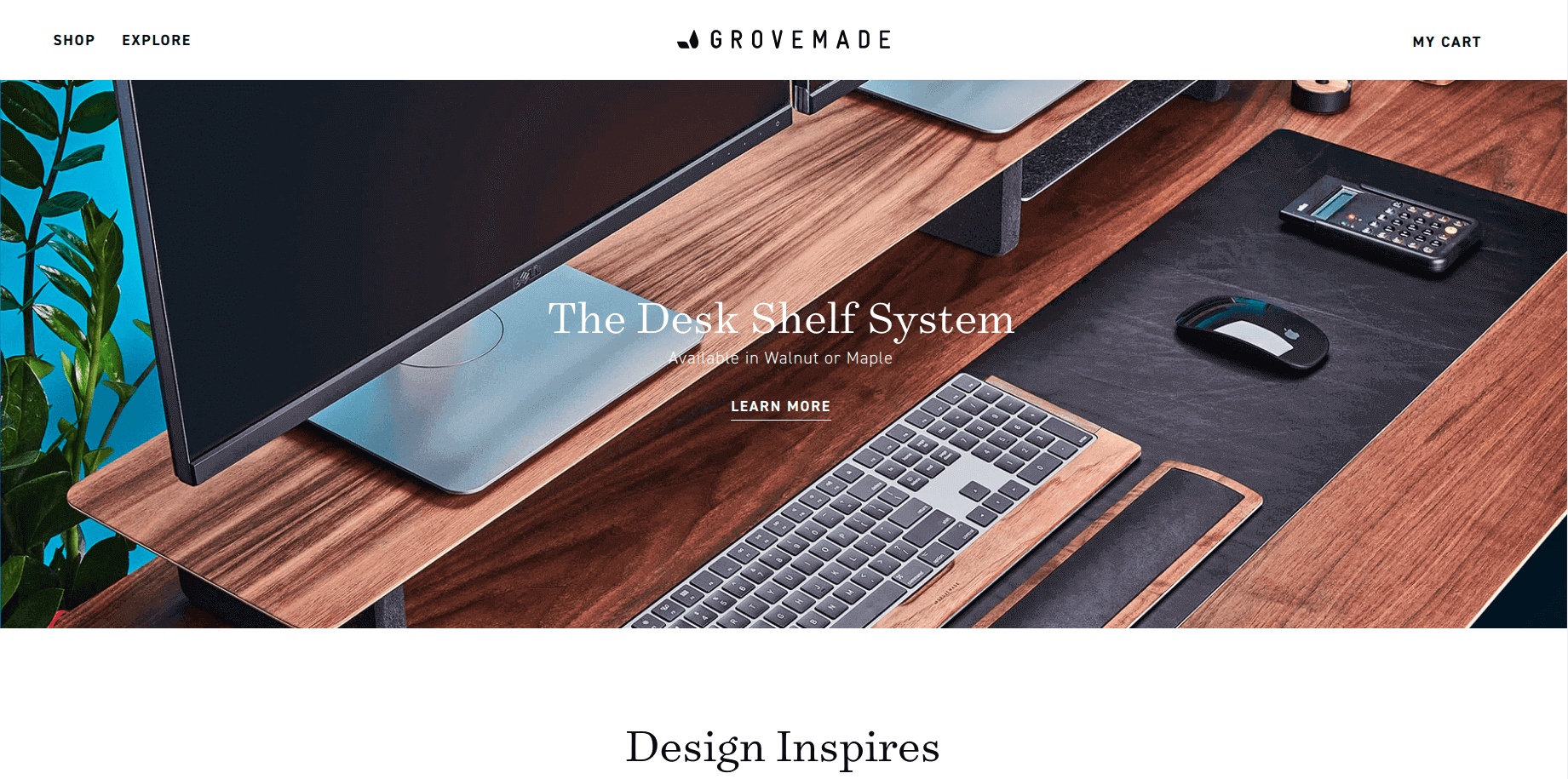
Grovemade has focused more on educating the visitors about their products and brand. When you scroll down on the homepage, you can see how creatively they showcased the people at Grovemade.
Flex
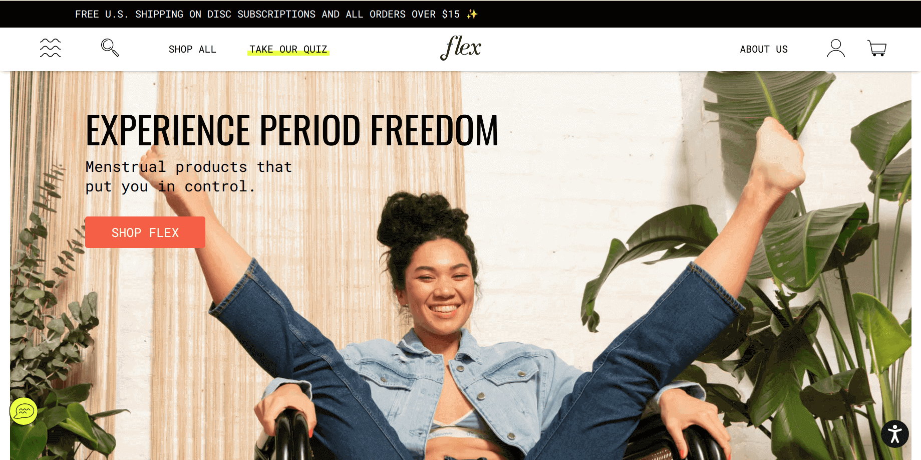
Flex is a bold and creative website. They have used highlights on the important links (on the white background) that reflect the highlighting theme. Don’t miss to visit the product page. They have also offered subscription plans for the customers to save their time and efforts on repurchase.
Hardgraft
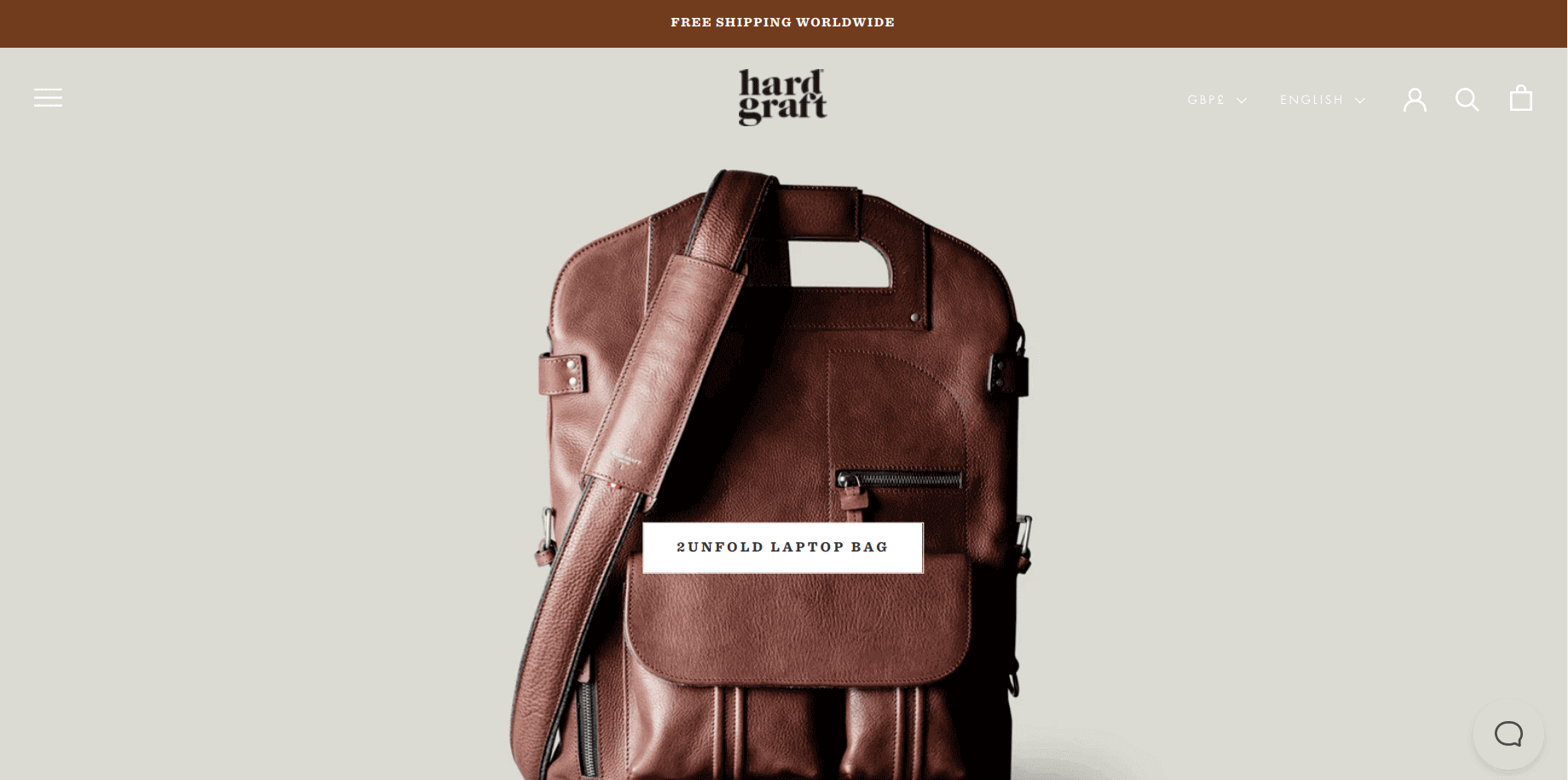
At a first glance, you can see the elegance of the store. Hardgraft uses high quality product photos to enrich the storefront look. The eye-catchy graphics on a light gray background makes it an outstanding Shopify storefront example.
NONA
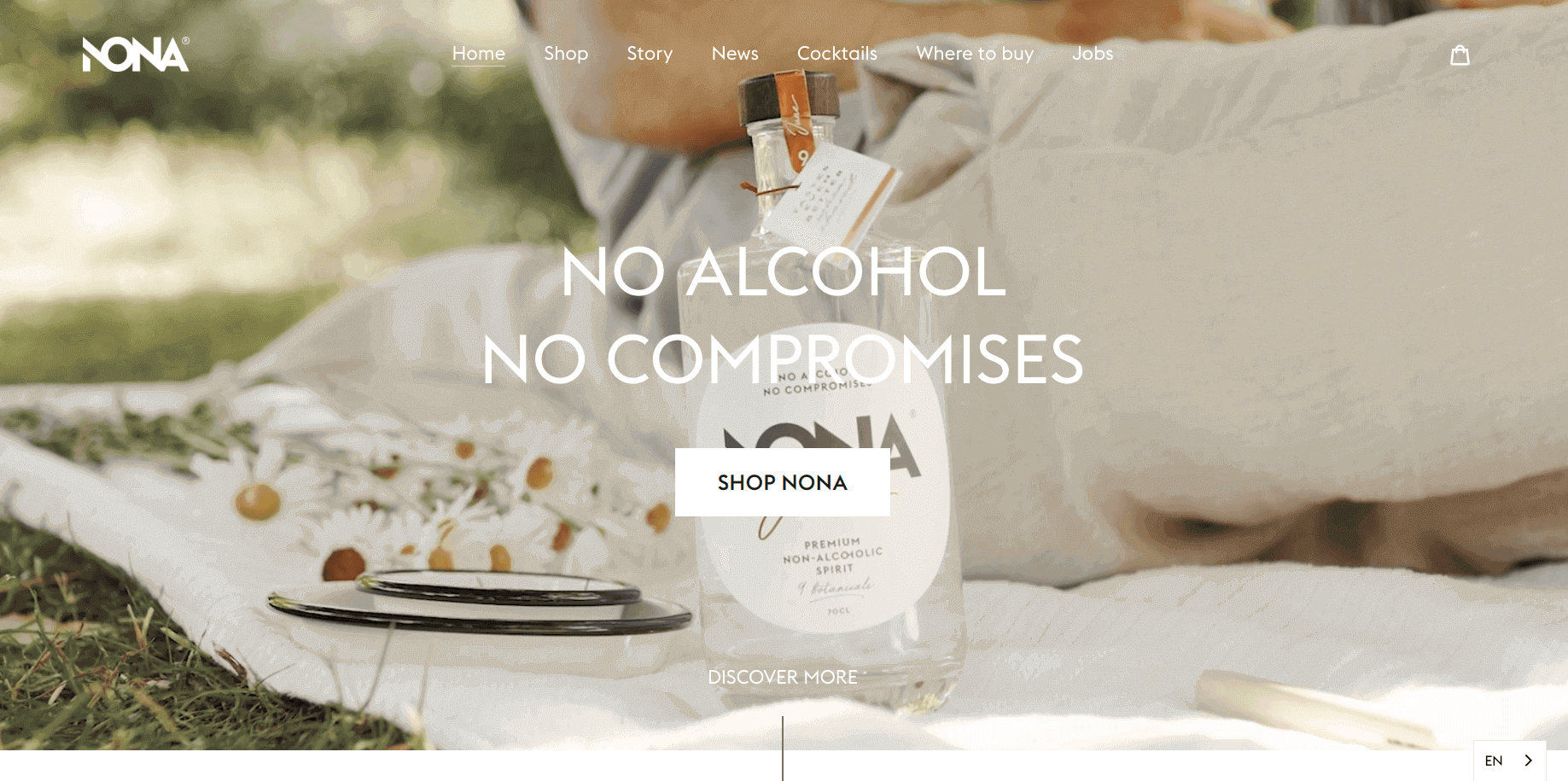
When you enter the store, it connects you with the brand and as you go down, it tells the rest story. The NONA store creates a good balance of graphics and modern fonts and makes it look more sophisticated.
Phone Loops
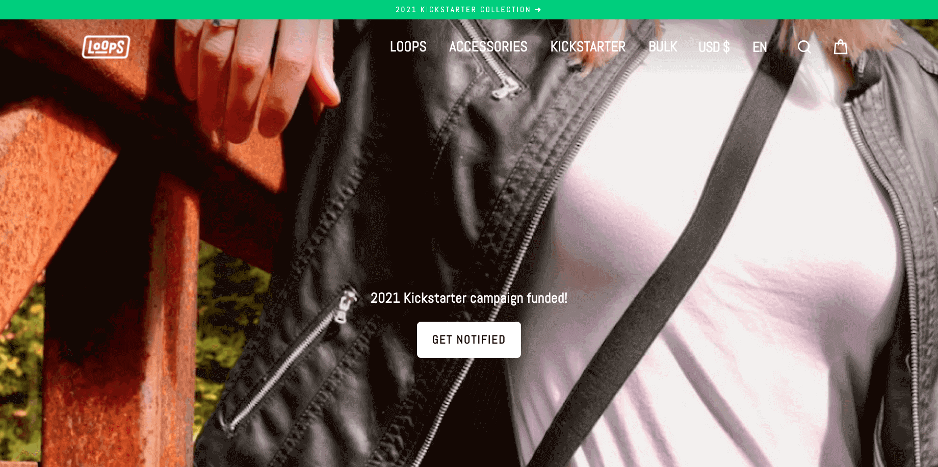
The Phone Loops website focuses more on selling products. So, they made it easy to browse the products, add items to the shopping cart, and checkout. The product collection on the homepage takes the shoppers on the purchase path.
Editors Keys
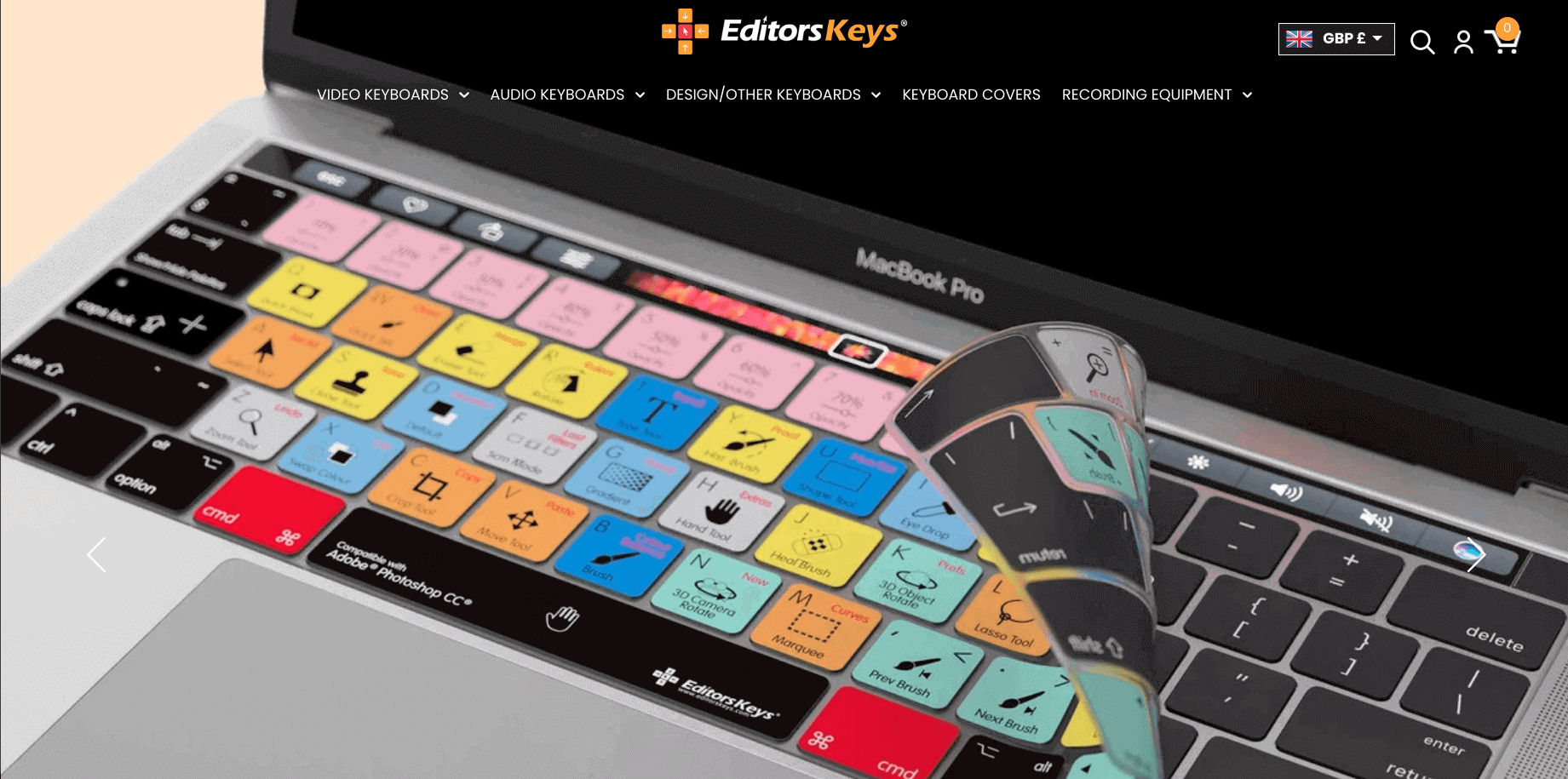
An interesting product and amazing photographs make this store stand out. The store gives the vibe of technology as you browse throughout the pages.
Haus
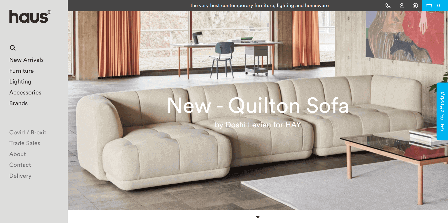
This store looks outstanding due to the sticky navigation panel on the left. Shoppers can easily browse through the products they are looking for. The color selection for the storefront is quite impressive.
Allbirds
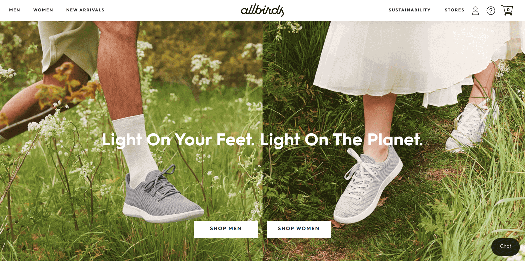
The storefront of Allbirds takes the shoppers to the origin. The header slider reminds me of the dawn theme. The combination of high quality images and modern fonts gives a premium look to this store.
Maiden Home
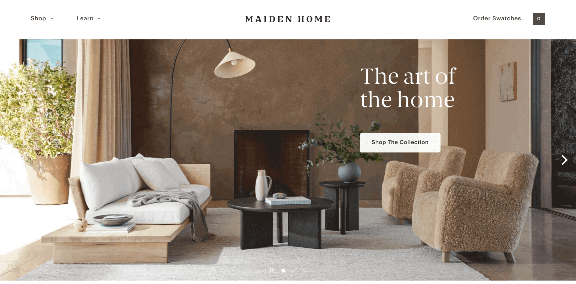
Maiden Home looks sophisticated at a first glance. They have used muted colors and pictures on a white background to create a perfect balance of beauty and luxury. The shoppers can easily browse the products as well as find the demonstration on the product page.
Flourist
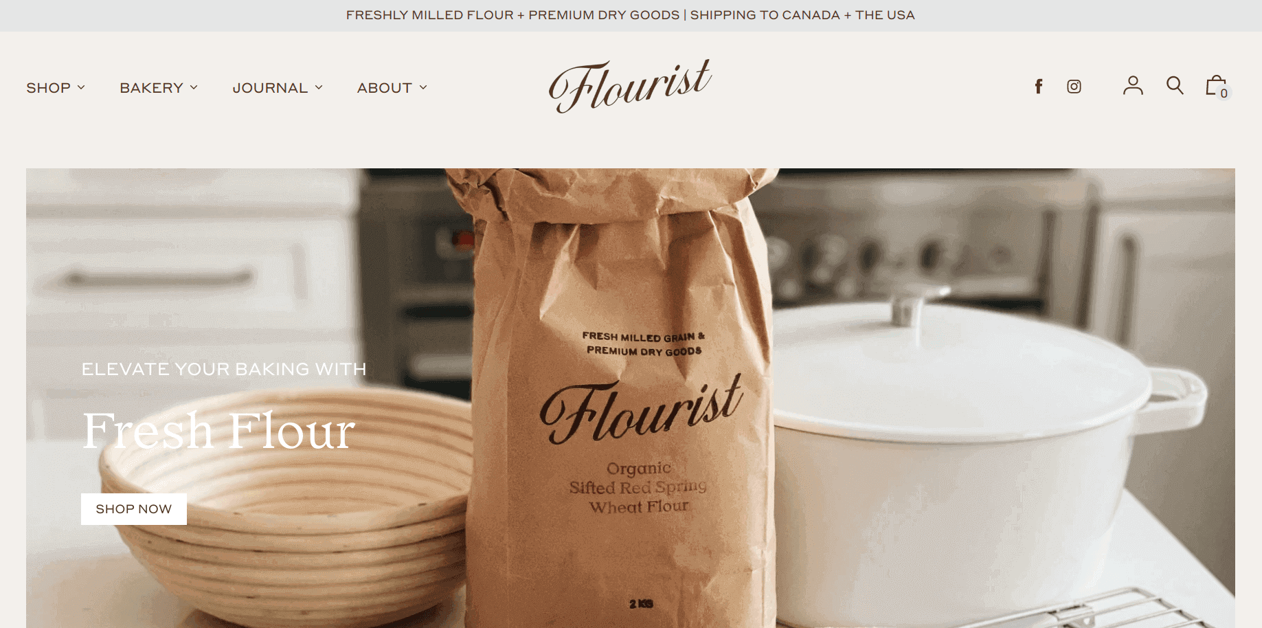
As you walk to this site, you can get how smartly this Shopify storefront is crafted. The color and picture selection is remarkable. They not only focus on selling, but they also believe in educating the customers with their guides and recipes.
Death Wish Coffee Co.
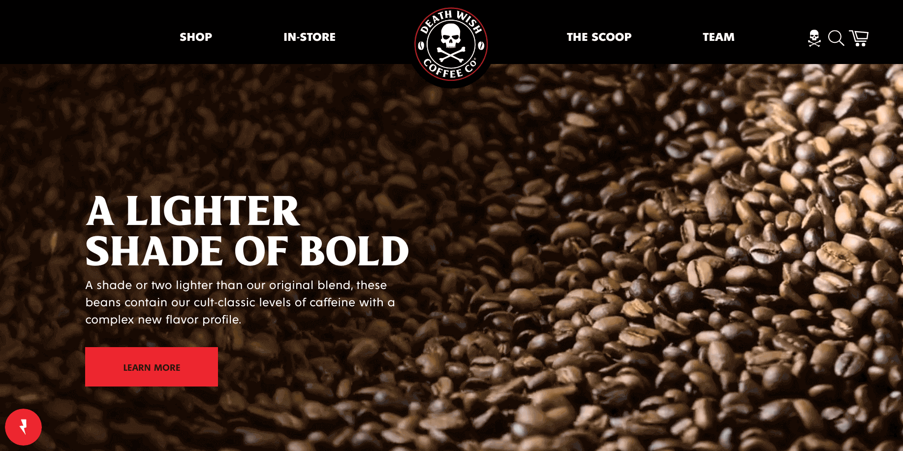
Black is always elegant. Death Wish Coffee has used the black color as the background and blood red as a highlighting color. And this combination justifies the brand name and helps the store look luxurious.
PRESS
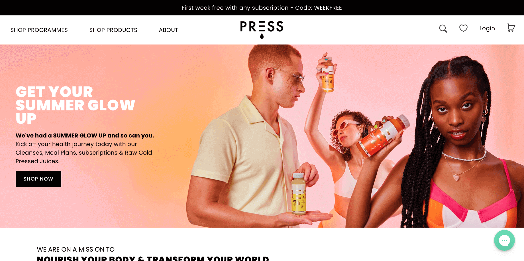
Similar to the PRESS products, its storefront gives fresh vibes to the site visitors. They have used vibrant colored product photos over a white background to create a stunning website.
Conclusion: Get inspired and create your Shopify store
The best Shopify storefronts make it easy for customers to browse, trust the brand, and buy without friction.
Use these examples as a blueprint, then focus on the fundamentals that actually move conversions: clean navigation, strong collections, fast-loading pages, mobile-first design, and product pages that answer questions before shoppers ask.
FAQs for Shopify storefront examples
1. What is a storefront on Shopify?
A Shopify storefront is the customer-facing shopping experience where people browse products, add to cart, and check out. It can be your standard Online Store (theme-based) or a custom/headless storefront built separately and connected to Shopify via the Storefront API.
2. What are some of the best examples of Shopify stores?
A few strong examples include Maguire Shoes, Goodfair, Fly by Jing, Cowboy, and Beauty Bakerie. They stand out because they nail brand storytelling, site UX, and clear merchandising that makes buying feel easy.
3. What are the common Shopify selling mistakes?
The biggest ones are selling without clear audience and product positioning, using weak product pages, and launching without trust basics like shipping, returns, and customer support clarity. Also, many stores lose sales by ignoring mobile speed, skipping technical SEO, and not testing checkout and shipping rates end-to-end.
4. What are some of the great Shopify beauty store examples?
Good beauty examples include Cheekbone Beauty, Meow Meow Tweet, The Honey Pot, Doe Beauty, and Wild. They do the fundamentals well for beauty: strong education, social proof, clear routines or use-cases, and low-friction shopping that builds trust fast.
5. What are the easiest things to sell on Shopify?
“Easiest” usually means low inventory and low shipping complexity. Digital products (templates, courses, downloads) and print-on-demand items are great starting points. Services, lightweight accessories, and simple replenishment products can also be easier because fulfillment stays predictable and margins are easier to manage.
6. What are the odds of having a successful Shopify store?
Broad small-business data shows over one-fifth of Shopify stores close in year one, and failure approaches about 50% by year five. The baseline is tougher than people expect, but your odds improve a lot if you validate demand early and avoid common Shopify mistakes around offer, UX, and customer acquisition.



About the author
Sagarika Das
Sagarika Das is a content writer with a passion for the ecommerce world. She crafts engaging, SEO-friendly content that helps online businesses connect with customers and grow.