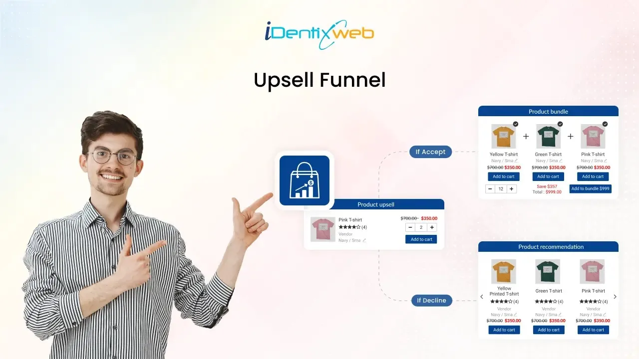
We are excited to introduce a pre-purchase funnel in our iCart app. This feature boosts sales and increases your average order value (AOV). You can easily add this upsell funnel to your Homepage and Product page for maximum customer engagement and visibility.
What is a Shopify Upsell Funnel?
An upsell funnel is a series of offers shown to customers as they shop or check out, encouraging them to add more items or choose higher-value options. These offers, like product upgrades, complementary items, or bundles, help businesses increase the average order value (AOV) and maximise each sale.
For example, if a customer adds a laptop to their cart, an upsell funnel might suggest adding accessories like a mouse or laptop sleeve before they complete their purchase.
An upsell funnel guides customers through relevant offers, which boosts sales and enhances the shopping experience by providing helpful recommendations.
How to Create an Upsell Funnel on Shopify
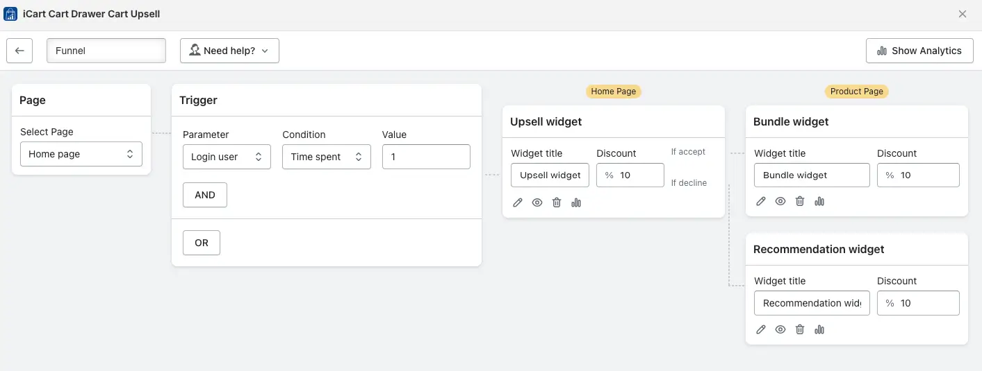
Here is the step-by-step guide to setting up a Shopify upsell funnel on the iCart app.
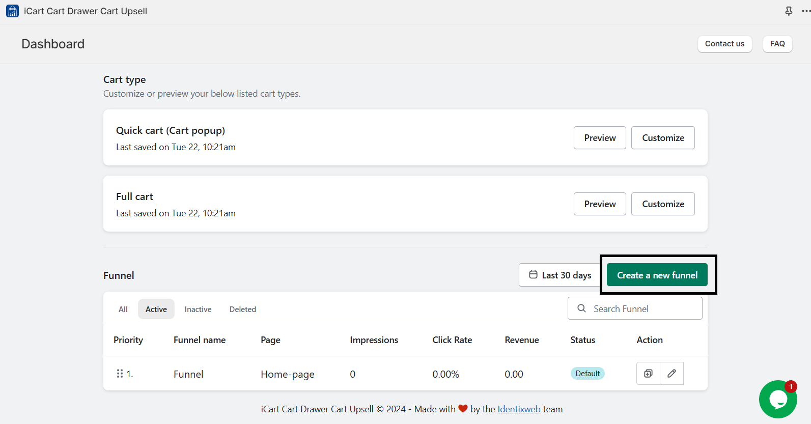
- Start with the dashboard page and select the Funnel option.
- Go with the top-right corner, and you can create a funnel.
Note:
- The first funnel you create is automatically assigned “default” status and will display if no other funnel triggers are met.
- After activating a specific funnel trigger, no other funnel triggers are checked.
- As a result, only one funnel is displayed per session based on the first satisfied trigger.
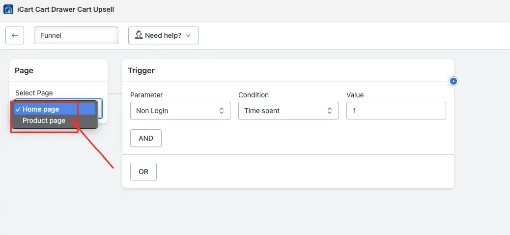
Page Selection
It depends on which option you choose:
- Select the Home Page option to add a widget to the homepage.
- Select the Product Page option to add a widget to the homepage.
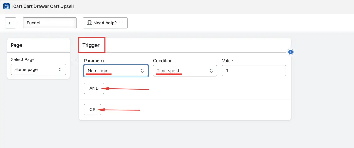
Trigger Settings
For example, You can configure the trigger to display a specific widget based on the country where the logged-in user lives.
How to Add a Widget
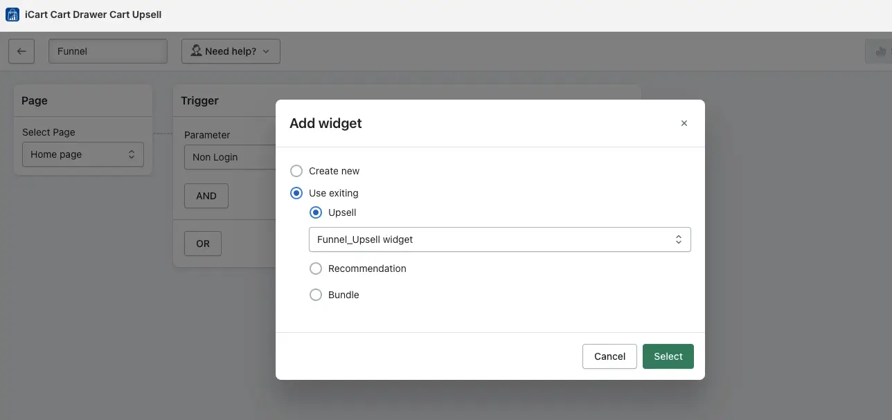
- After setting the conditions, select the widget to display on the homepage or product page. You can create a new one or use an existing widget.
- There are three widgets are available: Product Upsell, Product Recommendation, and Product Bundle. Each has its own functionalities.
- After selecting the widget, you can add a discount. For instance, if it’s an upsell widget, you can set a discount for the upsell product. Based on your conditions, the widget will appear on the homepage or product page, and the discount will apply when the customer adds the product from the widget.
- You can set up an additional upsell to display a new widget when a customer adds products to their cart from an existing offer.
- Customers who add an upsell product from an offer will see another offer on the corresponding product page.
- If you’ve already set up an offer for the product page, simply add the widget to the page as needed.
Operators Settings: Then and Otherwise
- “Then” and “otherwise” options are only available on the second page. For example, if you set a funnel from the Homepage to the Product page, you will see “then” and “otherwise” options on the product page, not the homepage.
- If you choose the “Otherwise” operator, customers will see both the previous widget and the newly created widget under the Otherwise operator.
- You can edit, hide, or delete the widget and view the analytics, which showcases the widget’s impressions, offer acceptance, and click-through rate.
- When creating a funnel for the first time, you must make all the necessary changes, including design and settings, to match your preferences.
- If you already have one funnel and want to create another, you can set up a new offer or use an existing widget. For existing widgets, you can just update the products without redesigning them.
Product Upsell Widget
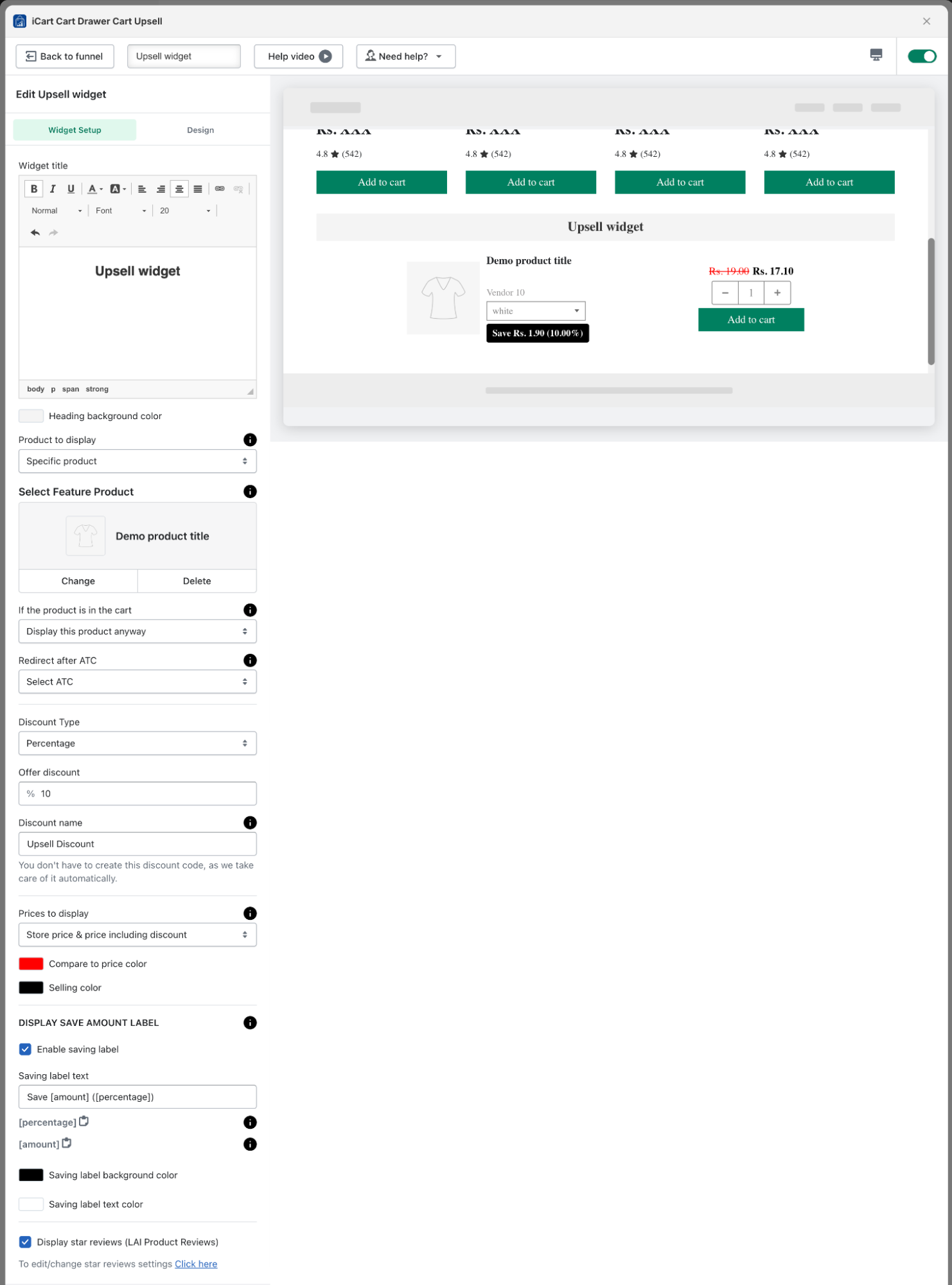
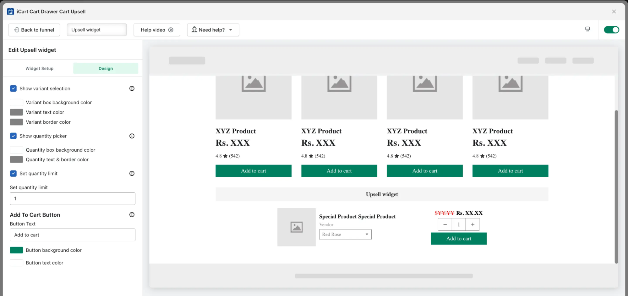
The product upsell widget is organized into two settings:
- Widget Setup
- Design
Let’s explore the widget setup process in more detail.
Upsell Widget Settings
How to Design Upsell Widget
Recommendation Widget
The Recommendation widget is organized into two settings:
Let’s explore the widget setup process in more detail.
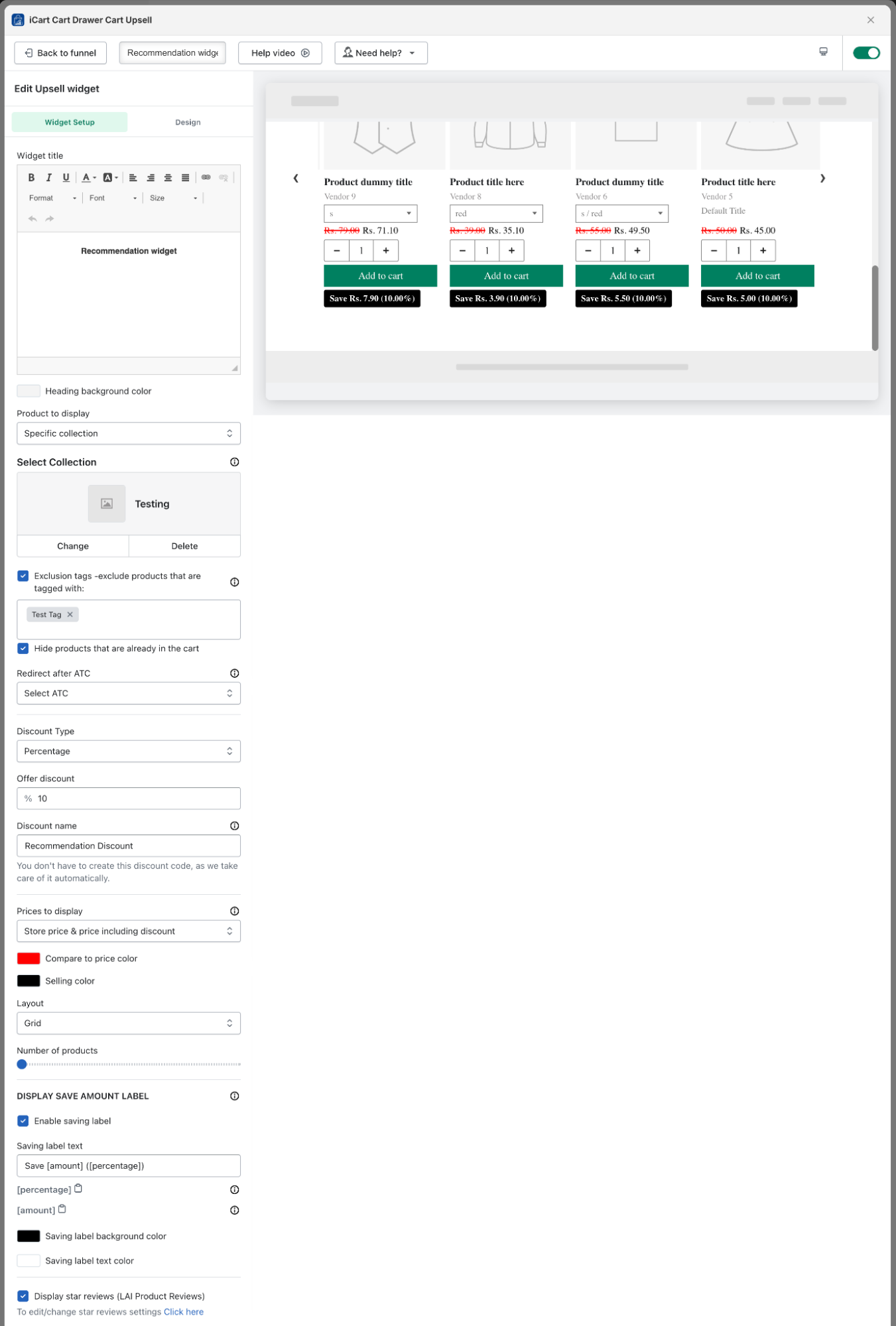
Recommendation Widget Setup
- Widget Title: You can add or modify the name of the widget. Additionally, you can change the title’s size and color and apply formatting such as bold, italic, or underline. You can also insert links into the widget title.
- Products to Display: You can set a specific collection or use Shopify’s recommendation option to display products as recommendations.
- Exclusion Tags: If you select a specific collection or Shopify recommendation and want to exclude certain products, you can use product tags to do so.
- Hide Products Already in the Cart: Any product already added to the cart will not be displayed in the recommendation widget when this option is enabled.
- Redirect After Add to Cart (ATC): If a customer adds a recommended product to their cart, you can decide where to send them next. The options include the cart drawer/popup, the full cart, the direct checkout page, or no redirection if the ‘select ATC’ option is selected.
- Discount Type: You can select the discount type, such as ‘percentage,’ ‘fixed amount,’ or ‘fixed amount per item.’ this also sets a minimum price for the discount to apply. If no discount is selected, the products will be shown at full price.
- Discount Name: You can customize the discount name to fit your preferences.
- Prices to Display: You can choose how to display product prices, such as only the “store price”, “store price and compare-at price”, “store price and compare-at price including discounts”, or store price including discounts. You can also customize the color of the compare-at price and selling price.
- Layout: You can choose to display the product recommendation widget in either a Grid or List format. Selecting Grid will show all products in a grid layout, while List will display them in a single-column list style.
- Number of Products: The recommendation widget can display between 12 and 60 products.
- Display Save Amount Label: Turn on this option to display a savings label, showing either the amount or percentage saved. You can also adjust the label’s background and text color to fit your style. This label will appear on each product.
- Review Integration: If you’ve connected a third-party review app with the iCart app, you can display product reviews on the recommendation widget. Supported apps include Loox, Rivyo, Judge.me, Stamped.io, Ali Reviews, Reviews.io and etc.
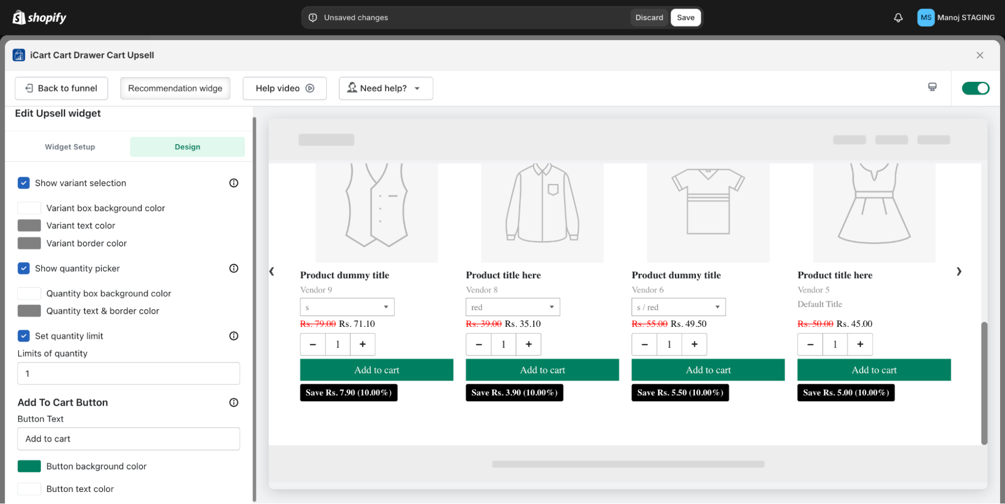
- Display Variant Selection: When this option is enabled, customers can select a variant for the product. If it’s turned off, the first available variant in stock will be shown by default. You can also personalize the variant box by adjusting its background, text, and border colors.
- Display Quantity Picker: With this option enabled, customers can choose their desired product quantity. If disabled, they will be limited to a single quantity. You can also adjust the background, text, and border colors of the quantity box to align with your theme.
- Set Quantity Limit: You can set a quantity limit for the product, restricting customers from adding unlimited items to the cart. For example, if you set the limit to 5, customers can only add up to 5 product units to the cart.
- Add to Cart Button: You can change the text of the Add to Cart button and customize its background color and text color to match your theme.
- Widget Setup
- Design
- Widget Title: You can customize the widget title by adjusting its size and color, and applying styles like bold, italic, or underline. Links can also be added to the title for extra functionality.
- Heading Background Color: You can change the heading background color to fit your theme.
- Bundle Type: You can select a specific collection or use Shopify’s recommendation feature to showcase products as a bundle
- Display the Product Anyway: This option lets you show the product in the bundle even if it’s already in the cart, keeping it visible as part of the bundle.
- Hide the Product if Already in the Cart: If you select this option, any product already in the cart will not be shown in the bundle, preventing duplicate items from appearing for customers.
- Display an Alternative Product: If one of the products in the bundle is already in the cart, you can choose to show an alternative product instead. This way, you offer customers more options while keeping the bundle offer active with a similar or complementary product.
- Redirect After Add to Cart (ATC): When a customer adds a bundle product to their cart, you can choose where to redirect them. Options include the cart drawer, full cart, direct checkout page, or no redirect if the ‘select ATC’ option is chosen.”
- Discount Type: You can set the discount type, such as a “percentage”, “fixed amount”, or a “fixed amount per item” added. You can also specify a minimum price for the discount to apply. If no discount is selected, only the products will be displayed without any discount.
- Discount Name: You can change the discount name according to your preference.
- Compare Price Color: The compare at price will be displayed by default, and you can choose a color for the compare price to match your theme.
- Display the Add to Cart Button: If you enable this option, an “Add to Cart” button will be displayed for each product in the bundle, allowing customers to add individual products to the cart. This is helpful if customers don’t want to purchase the entire bundle. You can also change the button text, text color, and background color to match your theme.
- Layout: You can display the bundle widget in Grid or List. If you choose Grid, products will be displayed in a grid view; if you choose List, they will be displayed in a list view.
- Offer Text Setting: If you want to display the offer price as a percentage or fixed amount, you can enable this option and customize the text according to your preference.
- Add to Cart Offer Text Setting: If this option is enabled, the discounted price (percentage or amount) will be displayed on the “Add to Cart” button.
- Review Integration: If you connected a compatible third-party review app with the iCart app, you can show product reviews on the bundle widget. The supported apps include Loox, Rivyo, Judge.me, Stamped.io, Ali Reviews, Reviews.io and Product Reviews.
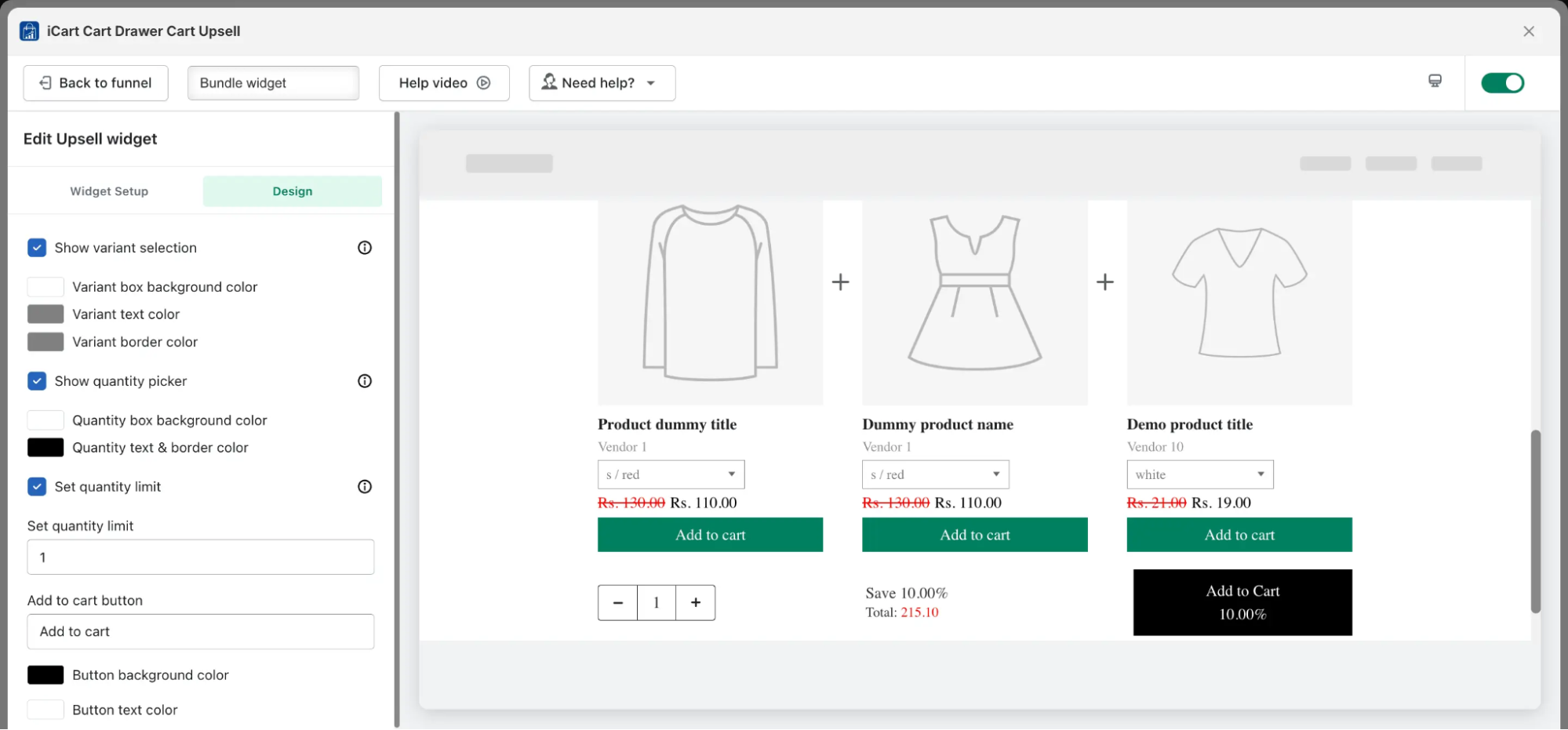
- Display Variant Selection: When enabled, customers can select the variant for the product. If not enabled, the first available variant with inventory will be shown by default. You also have the option to customize the background, text, and border colors of the variant box
- Display Quantity Picker: When this option is turned on, customers can choose the quantity of the product. If turned off, only one item can be added to the cart. You can also adjust the background, text, and border colors of the quantity box to align with your theme.
- Set Quantity Limit: You can customize a quantity limit for the product to stop customers from adding excessive amounts. For example, if you set the limit to 5, customers can only add up to 5 units of that product to their cart.
- Add to Cart Button: You can modify the text on the Add to Cart button and customize its background and text colors to match your theme.”
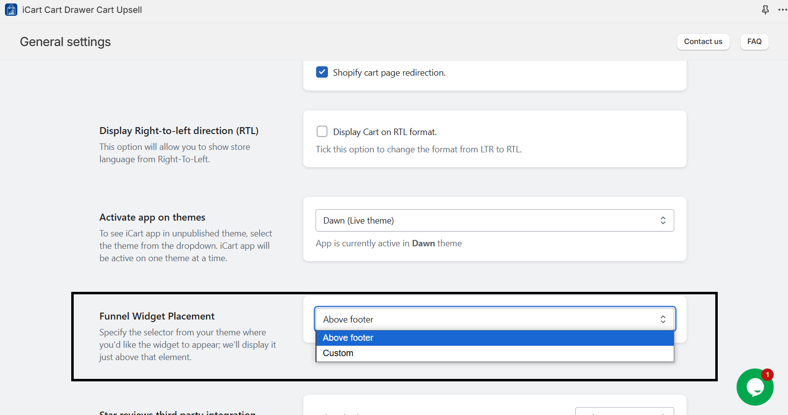
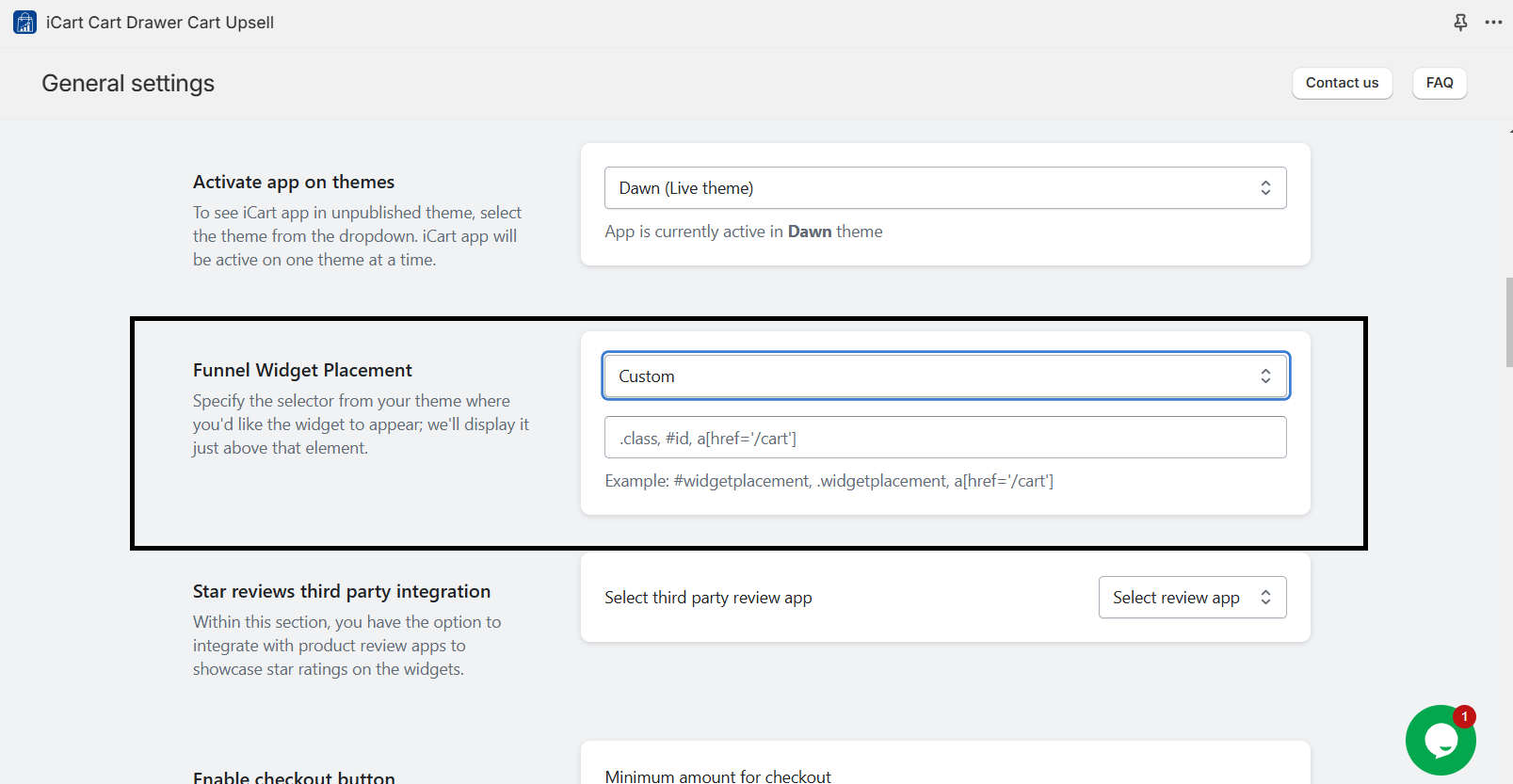
- There are two options: “Above footer” and “Custom”.
- By adding custom code, you can customize the placement of your widget exactly as needed. This flexibility allows you to position the widget in specific areas of your Shopify store, tailoring it to your store’s design and enhancing the customer shopping experience.
Design Recommendation Widget
Bundle Widget
The Bundle widget is organized into two settings:
Let’s explore the widget setup process in more detail.
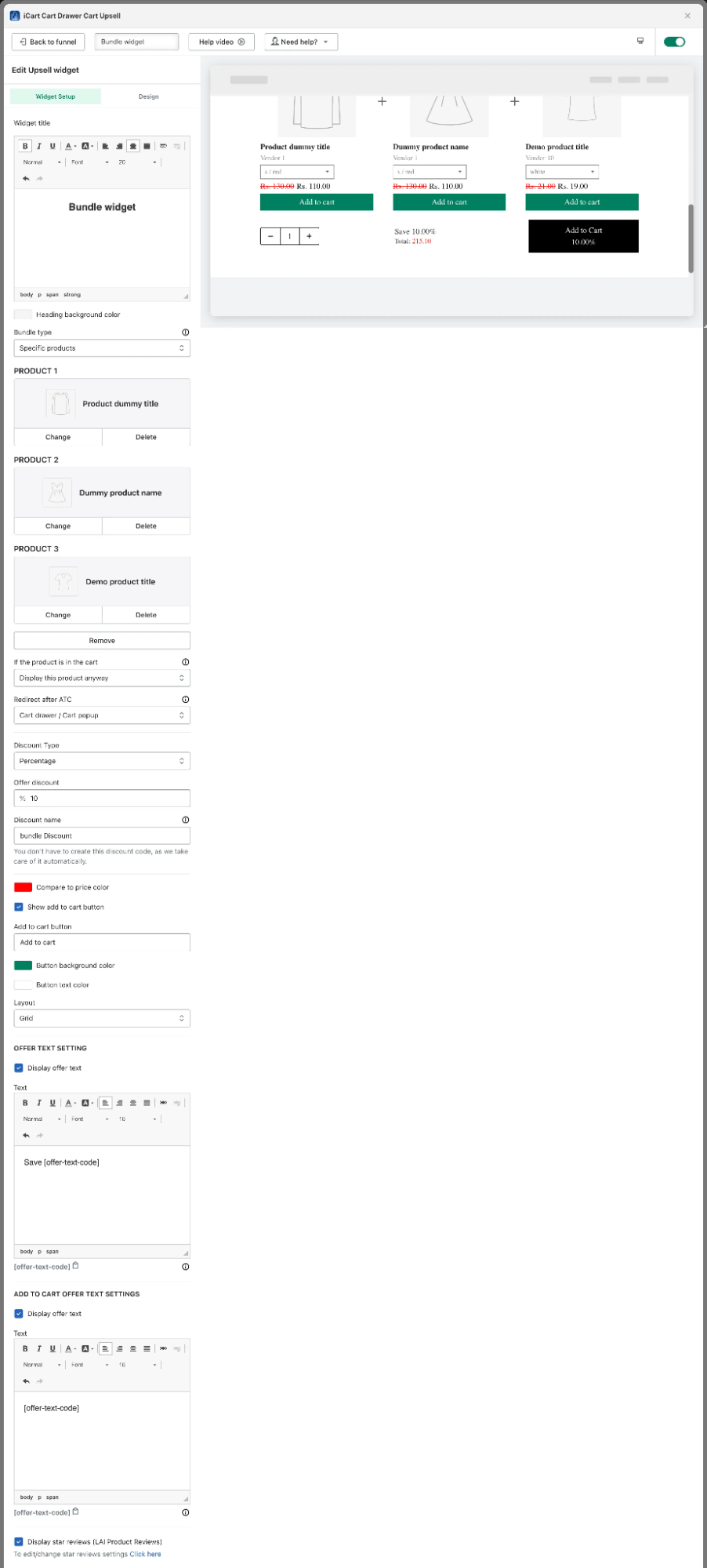
Bundle Widget Setup
You can create a bundle with two or three items by selecting specific products. If you opt for Shopify’s recommendation feature, the bundle will automatically include three products.
Exclusion Tags: Product tags can exclude specific items from a collection or Shopify’s recommended products.
If the Product is in the Cart: This option becomes available when you choose specific products for the bundle. You can then select one of three ways to manage products that are already in the cart.
Design Bundle Widget
General Setting
Choose the specific selector from your theme where you’d like the widget to appear, and we will place it just above that element. This lets you control where customers see the widget for the best visibility and user experience.
Video Tutorial for Building an Upsell Funnel
Please refer to the video tutorial below for an upsell funnel setup. Discover how to increase Shopify sales with upsell funnels for better customer engagement and order value.




About the author
Bhavesha Ghatode
Explore Content with Bhavesha, a passionate and dedicated technical content writer with a keen understanding of e-commerce trends. She is committed to sharing valuable insights, practical assets, and the latest trends that can help businesses thrive in a competitive environment.