
E-commerce is highly competitive, so guiding your customers towards making purchases is crucial. Among the best tools for achieving this is a well-crafted call-to-action (CTA). This blog explains what an ecommerce call to action is, the different types of ecommerce call to action, and seven powerful strategies to create CTAs that convert.
What is Ecommerce Call to Action?
A call to action, or CTA, is a prompt that encourages people to take a specific action. Think of it as a sign or button that tells you what to do next. For example, when you see a “Buy Now” button on a website, that’s a call to action. It tells you that you can purchase the item if you click it.
CTAs are everywhere, especially online. They can be found in emails, social media posts, and advertisements. A compelling CTA guides you towards taking action, whether that is registering for a newsletter, downloading an app, or watching a video.
A good CTA is clear and direct. It uses simple language so you know exactly what to do. For instance, “Sign Up Today” or “Learn More” are common CTAs. They make it easy for you to take the next step without thinking too much.
Types of Call To Action in Ecommerce
Call to action for ecommerce are like friendly nudges that guide visitors towards taking action on a website. Below are some different types of ecommerce CTA examples:
Limited Time Offer
A large banner saying “Sale ends in 12 hours!” might catch your eye. That’s a limited time offer CTA. It’s like when a store tells you they have a special deal, but it’s only available for a short time. As a result, you feel compelled to act immediately.
Learn More
Making decisions sometimes requires additional information. That is the purpose of the “Learn More” call to action. It is some small encouragement to continue exploring. In most cases, clicking on it takes you to a page with more details about a good or service. Before you make a purchase, this allows you to understand what you’re purchasing.
Subscribe Now
When was the last time you visited a website and it asked for your newsletter subscription? That’s a “Subscribe Now” CTA. It’s like saying, “Hey, want to stay in the loop? You can become part of their community and receive updates about their newest news, offers, and goods by subscribing.
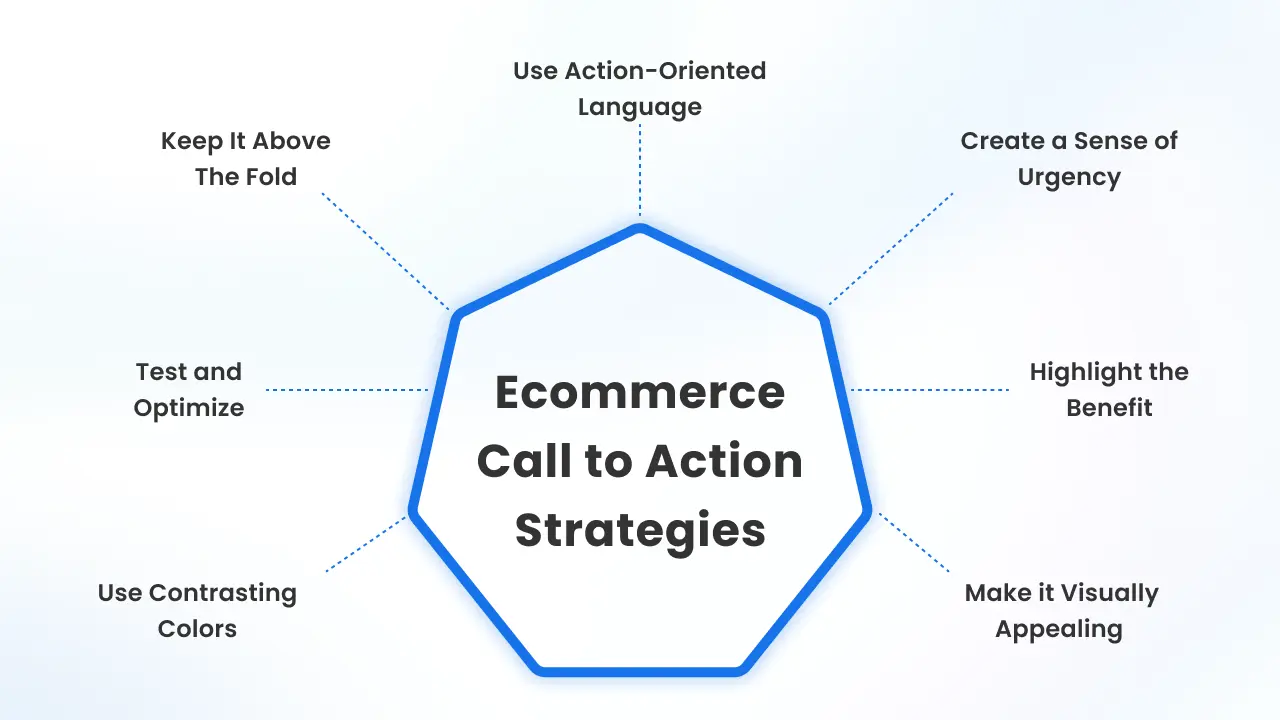
7 Strategies for Top Ecommerce Call to Action
Use Action-Oriented Language
Use actionable words in a call to action to motivate visitors to engage with the website. Your CTA should clearly tell the visitor what action to take. Make use of clear, powerful words such as “Buy,” “Shop,” “Sign Up,” or “Get Started.” Action words make it clear and easy for the visitor to understand what to do next.
Create a Sense of Urgency
Make your call to action for ecommerce more urgent to entice visitors to respond soon. The phrases “Limited Time Offer,” “Act Now,” and “Only a Few Left” are call to action button examples that might compel people to take immediate action. This tactic can be very effective in increasing conversions.
Highlight the Benefit
Make sure your CTA explains what the visitor will gain by clicking it. People are more likely to act if they understand the benefit. Instead of just “Sign Up,” you could say “Sign Up to Save 20%.” This way, visitors know exactly what they are getting.
Make it Visually Appealing
To grab attention, make your CTA visually appealing. Use a larger font size or a different style to make it stand out from the rest of the text. Adding icons or graphics that relate to the action can also make your CTA more appealing and engaging.
Use Contrasting Colours
The colour of your CTA button should contrast with the rest of your webpage. This makes it simple to identify. For example, if your website has a lot of blue, use a bright orange or green button. The key is to choose a colour that stands out and grabs attention without clashing with your overall design.
Test and Optimize
You can find out which CTAs work best by doing A/B testing on several variations. Test wording, colour, size, and placement variations to see what drives the most conversions. Based on performance data, regularly review and tweak your CTAs.
Keep it Above the Fold
Don’t make visitors scroll down the page just to see your call-to-action. Put it in a location where users can notice it immediately. This is known as keeping it “above the fold.” Most visitors spend only a few seconds on a page, so it’s crucial to catch their attention right away. Putting your CTA at the top increases the chances that more people will see and click on it.
3 Most Effective Calls to Actions for Ecommerce
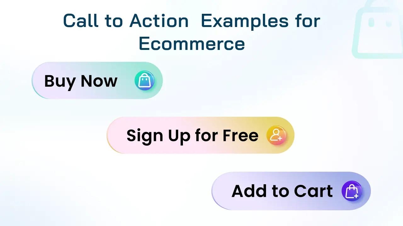
Well-designed ecommerce call to action capture the user’s attention and lead them down a desired action. The following are three effective ecommerce CTA examples:
Buy now
The “Buy Now” CTA is direct and creates a sense of urgency. It is frequently used together with time-limited or exclusive offers to encourage buyers to buy right away. With this CTA, buyers are prompted to purchase by having relevant offers presented to them.
Add to cart
The “Add to Cart” button is a classic example of a purchase CTA. It’s simple, clear, and directly tells the user what action to take. Usually, the button is in a color that contrasts with the rest of the product page, making it easy to find.
Sign up for free
Sign up for free is the best CTA for ecommerce sites offering subscriptions, newsletters, or member deals. This CTA highlights the benefit (it’s free), uses action-oriented language, and is short and to the point. The button stands out on the page, ensuring it catches the user’s attention.
Conclusion
A compelling call to action strategy is essential to guiding customers and increasing conversions in Shopify stores. Use these strategies to enhance your store’s performance and make your CTAs irresistible.
Always keep in mind that the best CTA for ecommerce are those that connect with your audience and motivate them to move forward. Ensure that your CTAs are always performing their best by testing and optimizing them.
FAQs
1. How do you write catchy CTA?
When writing a catchy CTA, be sure to use action-oriented language, create a sense of urgency, and highlight what’s in it for the reader.
2. What is CTA in Shopify?
CTA in Shopify is a conversion button that urges readers to take action on a website, blog or any form of communication
3. What is an example of a CTA in eCommerce?
Shop Now! is an example of a CTA in eCommerce, which encourages visitors to make a purchase immediately.
4. What is the ideal call to action button for an ecommerce store?
In ecommerce, a call to action CTA button should make it clear to visitors what the next step in their journey will be.





About the author
Bidisha Saha
Step into the content world with Bidisha Saha, a seasoned Senior Content Writer at Identixweb. Passionate about e-commerce, technology, and marketing, she optimizes online visibility, crafting engaging content for business growth. Join the journey through words and innovation with Bidisha.