

Do you ever wonder how customer behaviour affects your Shopify store’s UX and conversions? Are your website’s design and functionality user-friendly? There are countless factors that impact the shopify user experience, from the design of pages to the usability of websites. With a Shopify heatmap, you can understand exactly how users interact with your site, thus ensuring outstanding heatmap UX from start to finish. Here, we’ll talk about a Shopify heatmap, go over various types of heatmap for shopify, and how to use it to improve your website’s user experience.
What is a Shopify Heatmap?
Heatmaps are graphical tools that show customers’ interactions with a website using color-coded maps. It highlights what works and what doesn’t by displaying areas with high and low activity. Boosting your site’s conversions is as simple as understanding how to read a heatmap. A heatmap shopify shows where users spend the most time clicking, scrolling, and spending money. Using colored overlays, heatmaps show how users interact with your website.
Colors like red and orange are indicative of high involvement, while blue and purple are indicative of poor engagement. Yellow and green color are indicative of average engagement. Now that we know what is a heatmap, discover what different types of heatmaps there are.
Different Types of Heatmaps
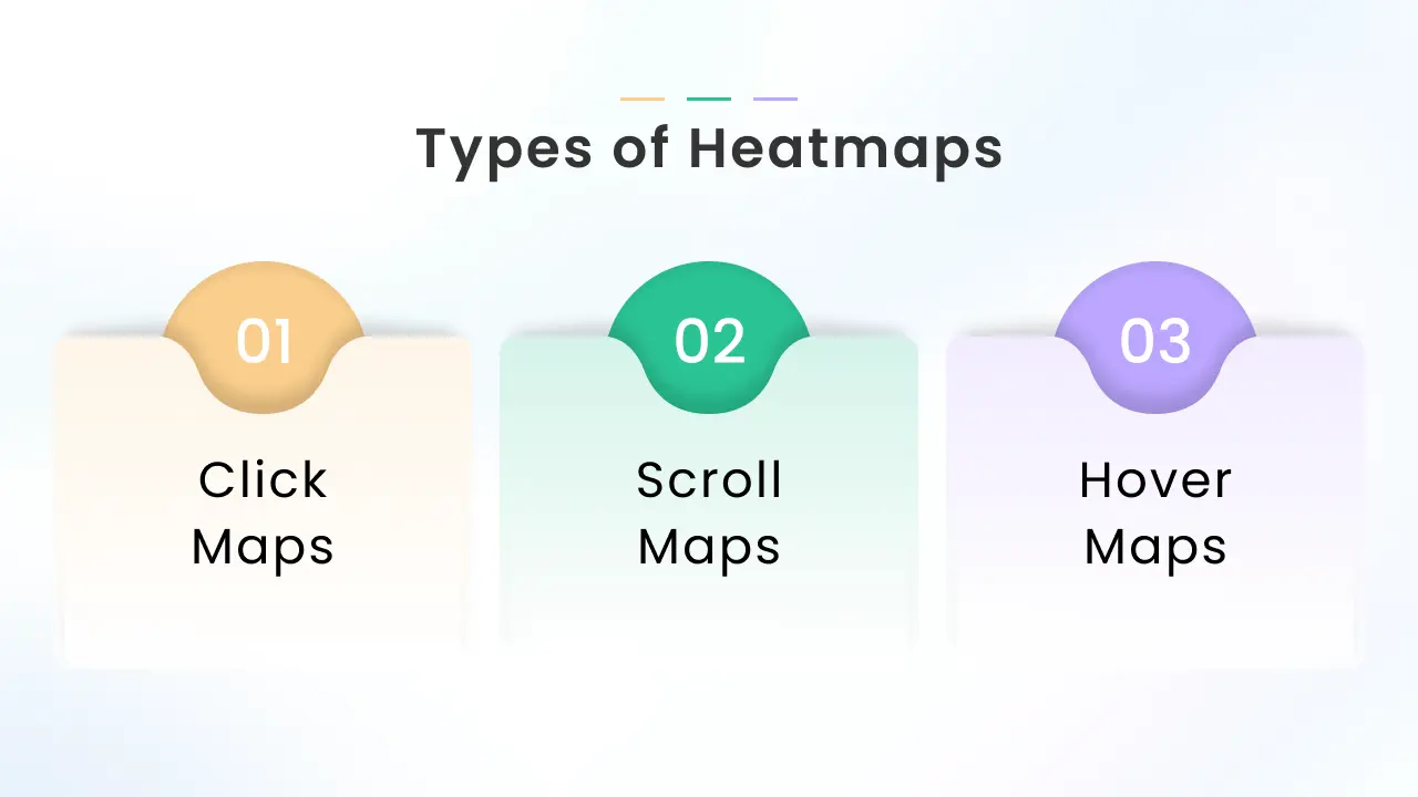
There are several variations of Shopify heatmap, and each one provides a different perspective on user behavior. The following are the common types-
Click maps
Click maps display where users click on your website. They assist you determine which areas of your website get the most attention by highlighting elements that are frequently used and overlooked. Generally, areas without color imply no clicks, areas with red indicate high clicks, and areas with blue indicate low clicks. Click maps help you learn how your page’s design affects how users engage with it.
As an example, placing call-to-action buttons in blue areas suggests they need to be redesigned or moved because they are not getting enough attention. Alternatively, if there is a non-clickable element in a red area, making it interactive might be a good strategy to capture the attention of the user.
Scroll maps
Scroll maps track the amount of time people spend on a webpage and show the points at which they become disinterested and stop using it. You can maximize page length and content placement with the use of this data. When it comes to longer pages, these heatmaps for shopify are useful for analyzing how people consume information. As you go further down the page, fewer people will continue reading. When you pinpoint the specific areas where users are dropping off, you can prioritize content and make the required design adjustments.
Hover maps
Hover maps, or mouse-tracking heat maps, reveal where visitors hover their cursors as they read your webpage. Areas that receive more cursor attention are displayed as ‘hotter’ zones. Utilizing this information, you can place important items strategically to increase their exposure and engagement.
For instance, when a certain call-to-action button receives a lot of cursor attention, you can presume users are interested in it and position it prominently.
The 5 Best Ways to Improve Your Website’s UX with Shopify Heatmap

After understanding the Shopify heatmap and how it operates, here are five ways you can use it to enhance your website’s UX.
Heatmap Analysis – Navigation is one of the key elements of UX. Having difficulty finding what you’re looking for will cause users to leave your site quickly. Analyze user engagement with the layout and style of your website by using click and scroll heatmaps for shopify. Identify which areas of the page are most frequently clicked on and how far down users scroll.
Actionable Steps
Result: A well-organized layout that guides users intuitively through your website, enhancing their overall experience
2. Enhance Call-to-Action Effectiveness
Heatmap Analysis – Calls to action, or CTAs, are used to encourage visitors to click on something, usually a button or link. They can be made especially to boost sales or sign-ups. Click maps display the most clicked CTAs as well as the most ignored. If other page elements distract users from your main CTA, you might identify an opportunity to test a new CTA in an area with high user engagement.
Actionable Steps
Result: More effective CTAs that drive higher engagement and conversions.
3. Improve Mobile Responsiveness
Heatmap Analysis – Use heatmaps with scroll and click features to examine user behavior on mobile devices in detail. Find areas where users are having trouble connecting with your site and highlight any problems with mobile responsiveness. Heatmaps show the most and least interesting sections of your website on mobile phones by displaying user activity visually.
Actionable Steps
Result: Websites that provide an excellent browsing experience and are optimized for mobile devices.
4. Enhance Content Placement and Readability
Heatmap Analysis – Utilize scroll and attention heatmaps to gather insightful data about how visitors engage with the content on your website. These heatmaps highlight places where viewers frequently drop off and show which parts of your content are the most engaging. A better understanding of user behavior will increase overall readability and optimize content placement.
Actionable Steps
Result: Enhanced content placement and readability that keep users engaged and informed.
5. A/B Test and Continuous Improvement
Heatmap Analysis – It’s simple to determine which version of a modified homepage would perform better by using A/B testing. Combining click maps with this type of testing can increase the effectiveness of your click maps greatly. A small adjustment like moving your call-to-action button or changing its color can sometimes result in a significant increase in conversions.
Actionable Steps
Test Variations: Use click maps to monitor user interactions and develop many iterations of important pages and components, including content, layouts, and call to action buttons
Assess Outcomes: Examine heatmap information from several iterations to determine which one generates more interaction and sales.
Result: A data-driven approach to website improvement that ensures continuous enhancement of shopify user experience.
Conclusion
A Shopify heatmap is an excellent tool for understanding user behavior and improving the user experience of your website. By leveraging the power of heatmap shopify, you can fine-tune every aspect of your site—from navigation and CTAs to mobile responsiveness and content clarity.
Don’t miss out on this game-changing tool that drives engagement and skyrockets conversions. Start using Shopify heatmap today and watch your store become a customer magnet, delivering a seamless, unforgettable experience that keeps shoppers coming back for more!


About the author
Bidisha Saha
Step into the content world with Bidisha Saha, a seasoned Senior Content Writer at Identixweb. Passionate about e-commerce, technology, and marketing, she optimizes online visibility, crafting engaging content for business growth. Join the journey through words and innovation with Bidisha.