Are you seeking to improve the performance of your Shopify store and increase customer happiness? Now let's discuss an important topic that many people should spend more time thinking about: the order confirmation. Whether a potential customer lands on your website or makes a purchase, every interaction between your business and a potential customer is important. The order confirmation page is a crucial place for helping boost your store, build customer loyalty, and increase sales.
Throughout this post, we'll cover five essential tactics you can use to optimize your Shopify order confirmation page. You can take advantage of this important touchpoint to give your customers a fulfilling and flawless experience and expand your business.
What is an Order Confirmation Page?
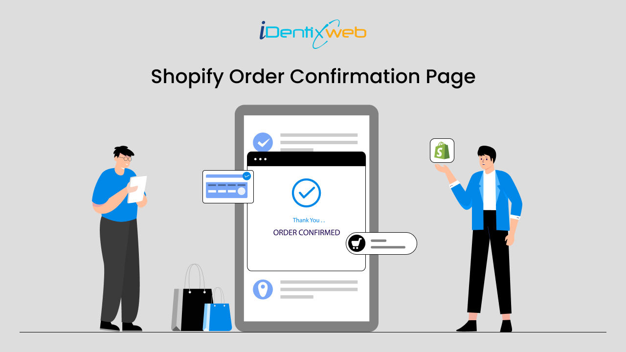
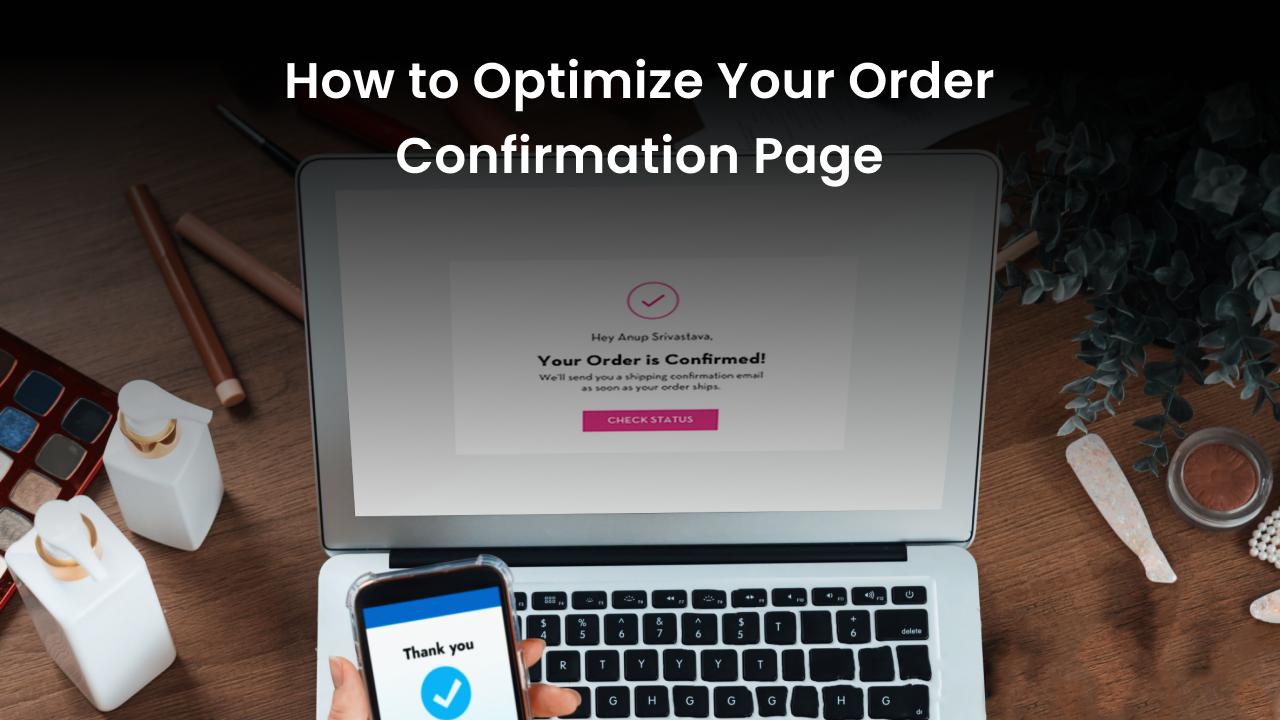
When you make an online purchase, you will see an Order Confirmation Page or Order Confirmed Page. The order confirmation page provides information about purchased items, quantities, prices, shipping addresses, and payment methods.
Customers are assured on this page that their order has been handled correctly and receive a transaction summary. It may also include an order number or reference code allowing tracking. Order confirmation pages are essential to e-commerce because they build customer trust, reduce post-purchase worries, and provide a reference point for any questions or errors. Moreover, they may include links to customer support, return policies, or similar products, further enriching the user experience.
Why Order Confirmation Page Matter?
The order confirmation page is essential to the client experience and directly affects your business's financial success. Why this is matters:
Comfort and Confirmation
The order confirmation page appears when you click the "buy" button, assuring you that your purchase went according to plan. This easy confirmation can resolve any concerns you may have regarding the status of your order.
Precise Details
It lists every item you purchased, the total cost, and extra expenses like taxes or shipping. This transparency ensures that there won't be any unexpected costs later on and helps you track your expenses.
Opportunity for More Shopping
Based on what you've previously purchased, the confirmation page recommends additional items you might find interesting. It's similar to seeing those enticing items at the grocery store checkout. The retailer can use this opportunity to offer you a better deal.
Help and Support
The confirmation page typically includes contact information for customer assistance if you have any questions or concerns about your order. It functions as a safety net in case something goes wrong.
Delivery Specifics
You will also find your product's approximate arrival time. You can even track your package as it travels to you with the tracking information provided by some confirmation pages.
Payment Security
A payment confirmation on the order confirmation page assures you that your funds have been transferred securely. It is similar to receiving a receipt when making a payment in person, confirming the transaction was successful.
How to Optimize Your Shopify Order Confirmation Page

Suppose a Shopify customer just bought something from you. How can you ensure customers have a wonderful experience even after clicking "buy"? Here are five easy ways to improve your Shopify order confirmation page so customers will return repeatedly.
Add Cross-Sells & Upsells to Get More Value
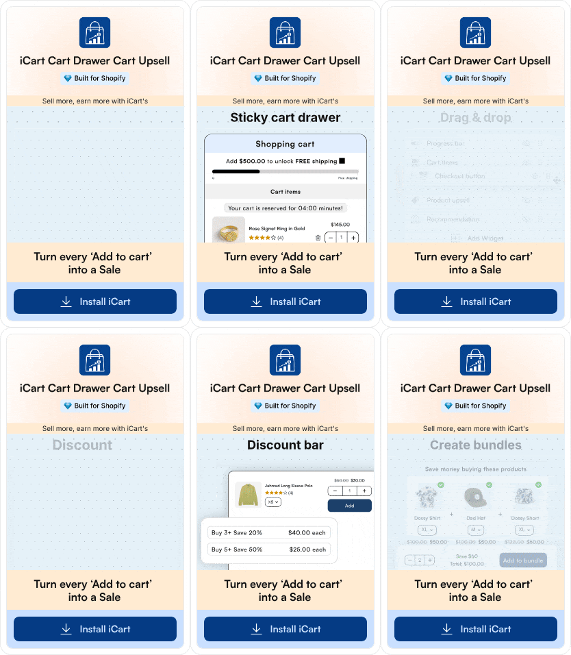
Why not recommend something else to a customer who has purchased something? Upsells and cross-sells are helpful in this scenario. Place some upgrades or related products directly on the order confirmation page Shopify. It's similar to stating, "Hey, since you bought this, you might also like that!" Your clients will be happier, and your sales will increase. Shopify apps like iCart Cart Drawer Cart Upsell can help you increase cross-sells and upsells in your store.
Add Social Proof and Trust Signals: Build Trust
Have you ever noticed the small badges or reviews left by customers on websites? Their purpose is to build trust. By including things like customer reviews or trust badges on your Shopify order confirmation page, you can tell your customers, "Hey, other people love us, and you can trust us, too." It's an easy method to boost people's confidence in their purchases.
Know more about How to Add Social Proof to Shopify Checkout Page
Add Shipping Updates: Keep Them in the Loop
People love to know where their valuables are, don't they? Thus, why not provide customers shipping updates directly from the confirmation page? Offer free shipping and display it as a badge or progress bar. Give them an approximate delivery date or allow them to track their purchases. Maintaining their information and providing them with adequate care is the key.
Order Summary: Keep It Clear
Nobody likes confusion, particularly over their order. Make sure everything is very clear in your order summary. Display to them the specific items they purchased, their total cost, and any savings they received. Additionally, remember to provide them with an easy way to modify their order if necessary. Just the way they like it: simple and clear!
Build Relationships with Triggered Videos: Personal Touch
Using videos to engage with your audience can be entertaining. How about personalizing your confirmation page with a video message? Express gratitude for their purchase, offer advice, or point them toward more exciting products. It all comes down to giving them that extra personal touch and making them feel valued.
Read more about How Video Marketing Can Boost Your Shopify Store
In summary
Improving your Shopify order confirmation page is essential for happy customers and more sales. By incorporating these strategies, you can turn a routine confirmation into a powerful tool for building customer loyalty. Add suggestions for other products, show reviews, and give shipping updates. Make sure the order details are easy to understand. Adding unique videos can make it even better. You must never forget that every customer interaction is an opportunity to improve the brand and build lasting relationships.
So, seize the chance to delight and impress them at every turn, starting with the order confirmation page. Make your order confirmation page great to make them happy. Focus on these things, and you'll sell more and have customers like you.
Ready to unlock your Shopify store's full potential? Let's optimize your order confirmation page today!
FAQ
1) How to edit the Order Confirmation Page Shopify?
In Shopify, navigate to "Settings" > "Notification" > "Order processing" > "Additional scripts" to edit the order confirmation page with HTML, CSS, or JavaScript.
2) What is the purpose of the order confirmation page on Shopify?
The order confirmation page on Shopify aims to reassure customers that their purchase was successful.
3) How do I track the performance of my Shopify order confirmation page?
Track Shopify order confirmation page performance using analytics tools like Google Analytics or Shopify's built-in reporting features.
4) How can I encourage customers to complete their purchases after abandoning their carts?
Offer discounts, send reminder emails, simplify checkout, and provide live chat support to encourage cart abandonment recovery.


![How to Transfer Shopify Store Ownership? [2026 Updated Tutorial] How to Transfer Shopify Store Ownership? [2026 Updated Tutorial]](https://www.identixweb.com/wp-content/uploads/2026/03/13-03-Fri-Blog-Complete-Tutorial-to-Change-Store-Owner-on-Shopify.webp)

About the author
Bidisha Saha
Step into the content world with Bidisha Saha, a seasoned Senior Content Writer at Identixweb. Passionate about e-commerce, technology, and marketing, she optimizes online visibility, crafting engaging content for business growth. Join the journey through words and innovation with Bidisha.