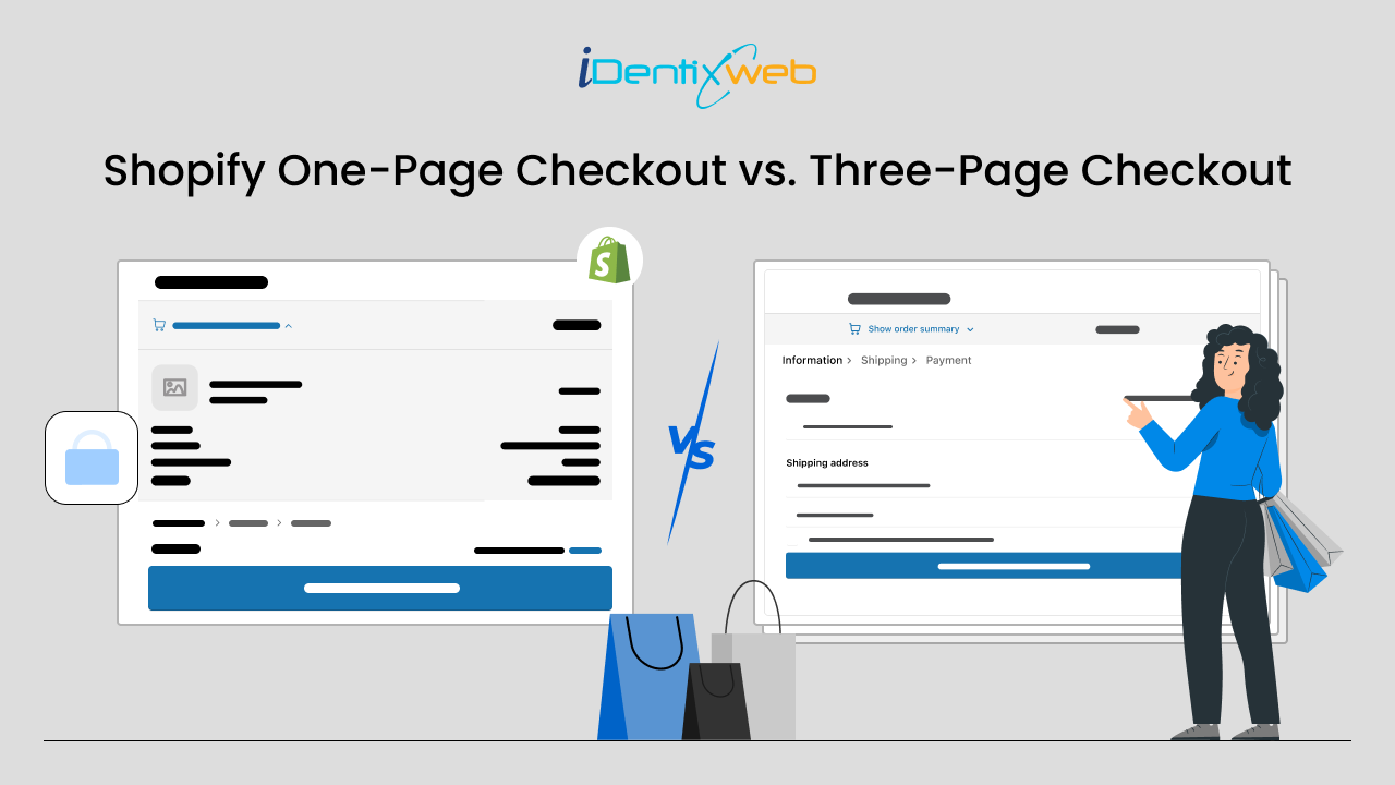
Finally the wait is over for Shopify merchants! Shopify one page checkout and three page checkout was one of the most anticipated feature by Shopify merchants. And the good news is that both are available now for merchants and it can be activated from your Shopify store itself.
In this blog, we will see the definition, comparison and customizing these layouts in your store.
Shopify One Page Checkout
One page checkout for Shopify is a out of the box checkout in Shopify. Compared to three-page checkout it is more faster and intuitive as it contains less steps. Onepage checkout allows customers to enter the details and review them within a single page itself. Shopify one-page checkout improves customers shopping experience and enhance conversion rate.
Comparison of One-page Checkout with Three-page Checkout
- The one page checkout also collects the same information from customers as the traditional three-page checkout.
- Compared to three page checkout, the one-page checkout is shorter due to it’s single page design.
- One page checkout has a shorter page load time which speeds up the process. The checkout speed is also high compared to three-page checkout.
- Design of Shopify single page checkout is straightforward and streamlined to improve the buying experience of customers. The intuitive design enhance the user experience.
- Talking about the analytics, same data will be shown just like three-page checkout.
- Customization options are also similar in one page checkout just like three-page checkout. But, the header layout of one-page checkout is different to three-page checkout. And this can impact on how your background image displays at checkout.
How to Change Your Checkout Layout between One-page and Three-page Checkout
For Shopify Plus Stores
If you are using Shopify Plus plan, then you can switch between one-page checkout and three-page checkout easily.
Step 1: Login to your Shopify admin, and go to Settings > Checkout.
Step 2: To open the checkout editor, go to Checkout customizations section and click on Customize.
Step 3: Click the gear icon shown on the checkout editor to access the Checkout profile settings.
Step 4: Now click the current layout option from the Checkout layout section and checkout layout options will be opened.
Step 5: Click One-page checkout or Three-page checkout to set the checkout layout and click Save.
For Non-Shopify Plus Stores
If your store is not on Shopify Plus plan then also you can switch between one page checkout and three page checkout.
Step 1: Open your Shopify admin, and go to Online Store > Themes.
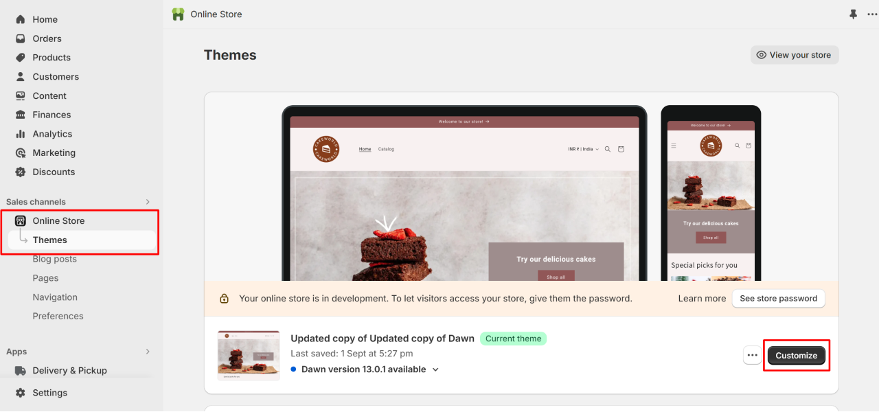
Step 2: To which theme you want to edit next to that click on Customize.
Step 3: Click the Settings icon, and then click Checkout.
Step 4: To open the checkout layout options, click on current layout from the checkout layout section.
Step 5: Now to set the checkout layout click on One-page checkout or Three-page checkout.
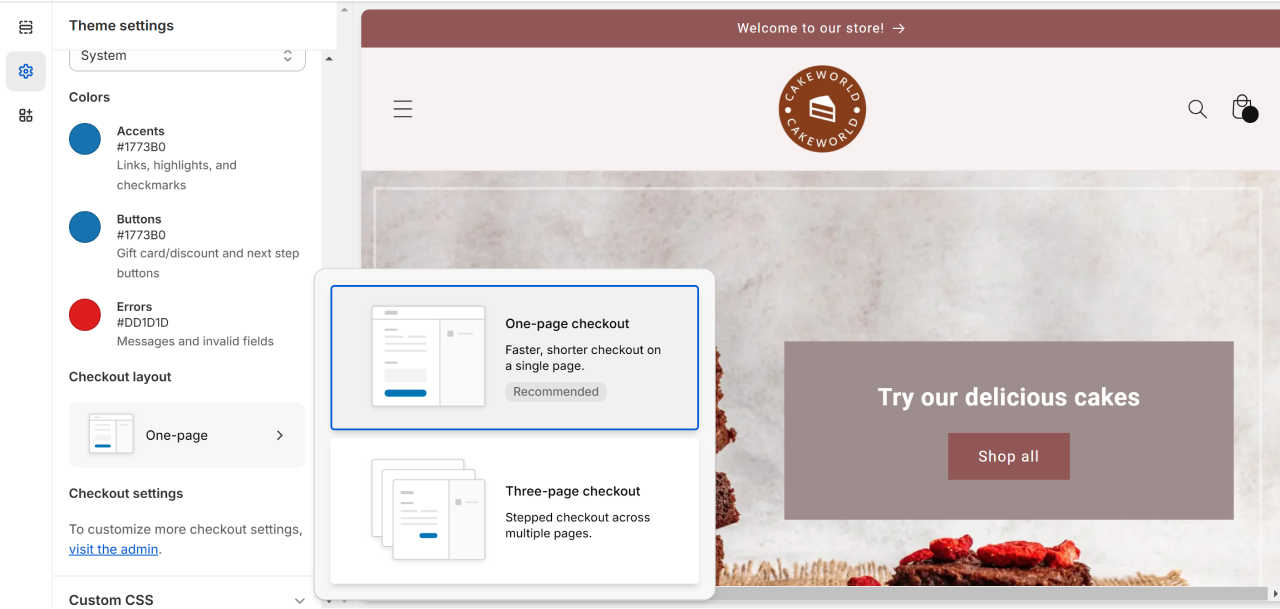
Step 6: Click on Save button.
Pros of Shopify One-Page Checkout
Streamlined Process: Reduces the number of steps, making it quicker and easier for customers to complete their purchases.
Reduced Cart Abandonment: With fewer steps, there's less chance for customers to drop off before completing the purchase.
Improved User Experience: Provides a seamless and user-friendly checkout process, enhancing customer satisfaction.
Higher Conversion Rates: The simplified process can lead to higher conversion rates as customers are more likely to complete their purchases.
Mobile-Friendly: One-page checkout is typically optimized for mobile devices, catering to the growing number of mobile shoppers.
Cons of Shopify One-Page Checkout
Limited Customization: May offer limited flexibility in terms of design and customization compared to multi-page checkouts.
Complexity for Detailed Information: If your product requires a lot of customization or detailed information from the customer, fitting it all on one page can be challenging.
Risk of Overwhelming Customers: For some customers, a one-page checkout might feel overwhelming, especially if they're not accustomed to this format.
Lack of Progress Indicators: Without clear progress indicators, customers might feel uncertain about how far along they are in the checkout process.
Potential for Clutter: Including all necessary information on one page can lead to clutter and confusion if not well organized or if too much information is presented at once.
Conclusion
Ultimately, the choice between a one-page and three-page checkout boils down to the unique needs and preferences of each individual merchant. Ultimately, the choice between a one-page and three-page checkout boils down to the unique needs and preferences of each individual merchant


![How to Create a Discount Code on Shopify [Easy New Tutorial] How to Create a Discount Code on Shopify [Easy New Tutorial]](https://www.identixweb.com/wp-content/uploads/2026/03/26-03-Thu-Blog-How-to-Easily-Create-a-Discount-Code-on-Shopify_-2.webp)

About the author
Sajini Annie John
Meet Sajini, a seasoned technical content writer with a passion for e-commerce and expertise in Shopify. She is committed to helping online businesses to thrive through the power of well-crafted content.